Posts
My thoughts and ideas
Welcome to the blog
My thoughts and ideas
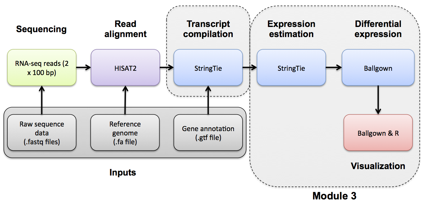
Introduction to bioinformatics for RNA sequence analysis
Navigate to the correct directory and then launch R:
cd $RNA_HOME/de/ballgown/ref_only
R
A separate R tutorial file has been provided below. Run the R commands detailed in the R script. All results are directed to pdf file(s). The output pdf files can be viewed in your browser at the following urls. Note, you must replace YOUR_PUBLIC_IPv4_ADDRESS with your own amazon instance IP (e.g., 101.0.1.101)).
First you’ll need to load the libraries needed for this analysis and define a path for the output PDF to be written.
#load libraries
library(ballgown)
library(genefilter)
library(dplyr)
library(devtools)

# set the working directory
setwd("~/workspace/rnaseq/de/ballgown/ref_only")
Next we’ll load our data into R.
# Define the conditions being compared for use later
condition = c("UHR", "UHR", "UHR", "HBR", "HBR", "HBR")

# Load the ballgown object from file
load("bg.rda")

# The load command, loads an R object from a file into memory in our R session.
# You can use ls() to view the names of variables that have been loaded
ls()

# Print a summary of the ballgown object
bg

# Load gene names for lookup later in the tutorial
bg_table = texpr(bg, "all")
bg_gene_names = unique(bg_table[, 9:10])

# Pull the gene and transcript expression data frame from the ballgown object
gene_expression = as.data.frame(gexpr(bg))
transcript_expression = as.data.frame(texpr(bg))

#View expression values for the transcripts of a particular gene symbol of chromosome 22.  e.g. 'TST'
#First determine the transcript_ids in the data.frame that match 'TST', aka. ENSG00000128311, then display only those rows of the data.frame
i = bg_table[, "gene_name"] == "TST"
bg_table[i,]

# Display the transcript ID for a single row of data
ballgown::transcriptNames(bg)[2763]

# Display the gene name for a single row of data
ballgown::geneNames(bg)[2763]

#What if we want to view values for a list of genes of interest all at once?
genes_of_interest = c("TST", "MMP11", "LGALS2", "ISX")
i = bg_table[, "gene_name"] %in% genes_of_interest

bg_table[i,]

# Load the transcript to gene index from the ballgown object
transcript_gene_table = indexes(bg)$t2g
head(transcript_gene_table)

#Each row of data represents a transcript. Many of these transcripts represent the same gene. Determine the numbers of transcripts and unique genes
length(unique(transcript_gene_table[, "t_id"])) #Transcript count
length(unique(transcript_gene_table[, "g_id"])) #Unique Gene count

# Extract FPKM values from the 'bg' object
fpkm = texpr(bg, meas = "FPKM")

# View the last several rows of the FPKM table
tail(fpkm)

# Transform the FPKM values by adding 1 and convert to a log2 scale
fpkm = log2(fpkm + 1)

# View the last several rows of the transformed FPKM table
tail(fpkm)
Now we’ll start to generate figures with the following R code.
#### Plot #1 - the number of transcripts per gene.
#Many genes will have only 1 transcript, some genes will have several transcripts
#Use the 'table()' command to count the number of times each gene symbol occurs (i.e. the # of transcripts that have each gene symbol)
#Then use the 'hist' command to create a histogram of these counts
#How many genes have 1 transcript?  More than one transcript?  What is the maximum number of transcripts for a single gene?
pdf(file="TranscriptCountDistribution.pdf")
counts=table(transcript_gene_table[, "g_id"])
c_one = length(which(counts == 1))
c_more_than_one = length(which(counts > 1))
c_max = max(counts)
hist(counts, breaks = 50, col = "bisque4", xlab = "Transcripts per gene", main = "Distribution of transcript count per gene")
legend_text = c(paste("Genes with one transcript =", c_one), paste("Genes with more than one transcript =", c_more_than_one), paste("Max transcripts for single gene = ", c_max))
legend("topright", legend_text, lty = NULL)
dev.off()

#### Plot #2 - the distribution of transcript sizes as a histogram
#In this analysis we supplied StringTie with transcript models so the lengths will be those of known transcripts
#However, if we had used a de novo transcript discovery mode, this step would give us some idea of how well transcripts were being assembled
#If we had a low coverage library, or other problems, we might get short "transcripts" that are actually only pieces of real transcripts
pdf(file = "TranscriptLengthDistribution.pdf")
hist(bg_table$length, breaks = 50, xlab = "Transcript length (bp)", main = "Distribution of transcript lengths", col = "steelblue")
dev.off()

#### Plot #3 - distribution of gene expression levels for each sample
# Create boxplots to display summary statistics for the FPKM values for each sample
# set color based on condition which is UHR vs. HBR
# set labels perpendicular to axis (las=2)
# set ylab to indicate that values are log2 transformed
pdf(file = "All_samples_FPKM_boxplots.pdf")
boxplot(fpkm, col = as.numeric(as.factor(condition)) + 1,las = 2,ylab = "log2(FPKM + 1)")
dev.off()

#### Plot 4 - BoxPlot comparing the expression of a single gene for all replicates of both conditions
# set border color for each of the boxplots
# set title (main) to gene : transcript
# set x label to Type
# set ylab to indicate that values are log2 transformed

pdf(file = "TST_ENST00000249042_boxplot.pdf")
transcript = which(ballgown::transcriptNames(bg) == "ENST00000249042")[[1]]
boxplot(fpkm[transcript,] ~ condition, border = c(2, 3), main = paste(ballgown::geneNames(bg)[transcript],": ", ballgown::transcriptNames(bg)[transcript]), pch = 19, xlab = "Type", ylab = "log2(FPKM+1)")

# Add the FPKM values for each sample onto the plot
# set plot symbol to solid circle, default is empty circle
points(fpkm[transcript,] ~ jitter(c(2,2,2,1,1,1)), col = c(2,2,2,1,1,1)+1, pch = 16)
dev.off()


#### Plot 5 - Plot of transcript structures observed and expression level for UHR vs HBR with representative replicate

pdf(file = "TST_transcript_structures_expression.pdf")
par(mfrow = c(2, 1))
plotTranscripts(ballgown::geneIDs(bg)[transcript], bg, main = c("TST in HBR"), sample = c("HBR_Rep1"), labelTranscripts = TRUE)
plotTranscripts(ballgown::geneIDs(bg)[transcript], bg, main = c("TST in UHR"), sample = c("UHR_Rep1"), labelTranscripts = TRUE)
dev.off()

# Exit the R session
quit(save = "no")
Remember that you can view the output graphs of this step on your instance by navigating to this location in a web browser window:
https://YOUR_PUBLIC_IPv4_ADDRESS/rnaseq/de/ballgown/ref_only/Tutorial_Part2_ballgown_output.pdf