Posts
My thoughts and ideas

Welcome to the blog
My thoughts and ideas
Introduction to bioinformatics for RNA sequence analysis
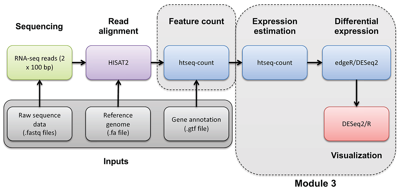
Occasionally you may wish to reformat and work with expression estimates in R in an ad hoc way. Here, we provide an optional/advanced tutorial on how to visualize your results for R and perform “old school” (non-ballgown, non-DESeq2) visualization of your data.
In this tutorial you will:
Expression and differential expression files will be read into R. The R analysis will make use of the gene-level expression estimates from HISAT2/Stringtie (TPM values) and differential expression results from HISAT2/htseq-count/DESeq2 (fold-changes and p-values).
Start RStudio, or launch a posit Cloud session, or if you are using AWS, navigate to the correct directory and then launch R:
First you’ll load your libraries and your data.
#Load your libraries
library(ggplot2)
library(gplots)
library(GenomicRanges)
library(ggrepel)

#Set a base working directory
setwd("~/workspace/rnaseq/")
#setwd("/cloud/project/")


#Import expression results (TPM values) from the HISAT2/Stringtie pipeline (https://genomedata.org/cri-workshop/gene_tpm_all_samples.tsv)
gene_expression = read.table("~/workspace/rnaseq/expression/stringtie/ref_only/gene_tpm_all_samples.tsv", header = TRUE, stringsAsFactors = FALSE, row.names = 1)
# gene_expression = read.table("data/bulk_rna/gene_tpm_all_samples.tsv", header = TRUE, stringsAsFactors = FALSE, row.names = 1)

#Import gene name mapping file (https://genomedata.org/cri-workshop/ENSG_ID2Name.txt)
gene_names=read.table("~/workspace/rnaseq/de/htseq_counts/ENSG_ID2Name.txt", header = FALSE, stringsAsFactors = FALSE)
# gene_names=read.table("data/bulk_rna/ENSG_ID2Name.txt.gz", header = FALSE, stringsAsFactors = FALSE)

colnames(gene_names) = c("gene_id", "gene_name")

#Import DE results from the HISAT2/htseq-count/DESeq2 pipeline (https://genomedata.org/cri-workshop/deseq2/DE_all_genes_DESeq2.tsv)
results_genes = read.table("~/workspace/rnaseq/de/htseq_counts/deseq2/DE_all_genes_DESeq2.tsv", sep = "\t", header = TRUE, stringsAsFactors = FALSE)
# results_genes = read.table("outdir/DE_all_genes_DESeq2.tsv", sep = "\t", header = TRUE, stringsAsFactors = FALSE)

#Set a directory for the output to go to
# output_dir = "/cloud/project/outdir/visualization_advanced/"
output_dir = "~/workspace/rnaseq/visualization_advanced/"
if (!dir.exists(output_dir)) {
  dir.create(output_dir, recursive = TRUE)
}
setwd(output_dir)
Let’s briefly explore the imported data
#### Working with 'dataframes'
#View the first five rows of data (all columns) in the gene_expression (Stringtie TPM) dataframe
head(gene_expression)

#View the column names
colnames(gene_expression)

#View the row names
row.names(gene_expression)

#Determine the dimensions of the dataframe.  'dim()' will return the number of rows and columns
dim(gene_expression)

#Get the first 3 rows of data and a selection of columns
gene_expression[1:3, c(1:3, 6)]

#Do the same thing, but using the column names instead of numbers
gene_expression[1:3, c("HBR_Rep1", "HBR_Rep2", "HBR_Rep3", "UHR_Rep3")]

#Now, exlore the differential expression (DESeq2 results)
head(results_genes)
dim(results_genes)

#Assign some colors for use later.  You can specify color by RGB, Hex code, or name
#To get a list of color names:
colours()
data_colors = c("tomato1", "tomato2", "tomato3", "royalblue1", "royalblue2", "royalblue3")
The following code blocks are to generate various plots using the above data set.
#### Plot #1 - View the range of values and general distribution of TPM values for all 6 libraries
#Create boxplots for this purpose
#Display on a log2 scale and set a minimum non-zero value to avoid log2(0)
min_nonzero = 1

# Set the columns for finding TPM and create shorter names for figures
data_columns = c(1:6)
short_names = c("HBR_1", "HBR_2", "HBR_3", "UHR_1", "UHR_2", "UHR_3")

pdf(file = "All_samples_TPM_boxplots.pdf")
boxplot(log2(gene_expression[, data_columns] + min_nonzero), col = data_colors, names = short_names, las = 2, ylab = "log2(TPM)", main = "Distribution of TPMs for all 6 libraries")
#Note that the bold horizontal line on each boxplot is the median
dev.off()

#### Plot #2 - plot a pair of replicates to assess reproducibility of technical replicates
#Tranform the data by converting to log2 scale after adding an arbitrary small value to avoid log2(0)
x = gene_expression[, "UHR_Rep1"]
y = gene_expression[, "UHR_Rep2"]
pdf(file = "UHR_Rep1_vs_Rep2_scatter.pdf")
plot(x = log2(x + min_nonzero), y = log2(y + min_nonzero), pch = 16, col = "blue", cex = 0.25, xlab = "TPM (UHR, Replicate 1)", ylab = "TPM (UHR, Replicate 2)", main = "Comparison of expression values for a pair of replicates")

#Add a straight line of slope 1, and intercept 0
abline(a = 0, b = 1)

#Calculate the correlation coefficient and display in a legend
rs = cor(x, y)^2
legend("topleft", paste("R squared = ", round(rs, digits = 3), sep = ""), lwd = 1, col = "black")
dev.off()

#### Plot #3 - Scatter plots with a large number of data points can be misleading ... regenerate this figure as a density scatter plot
pdf(file = "UHR_Rep1_vs_Rep2_SmoothScatter.pdf")
colors = colorRampPalette(c("white", "blue", "#007FFF", "cyan","#7FFF7F", "yellow", "#FF7F00", "red", "#7F0000"))
smoothScatter(x = log2(x + min_nonzero), y = log2(y + min_nonzero), xlab = "TPM (UHR, Replicate 1)", ylab = "TPM (UHR, Replicate 2)", main = "Comparison of expression values for a pair of replicates", colramp = colors, nbin = 200)
dev.off()

#### Plot #4 - Scatter plots of all sets of replicates on a single plot
#Create a function that generates an R plot.  This function will take as input the two libraries to be compared and a plot name
plotCor = function(lib1, lib2, name){
	x = gene_expression[, lib1]
	y = gene_expression[, lib2]
	colors = colorRampPalette(c("white", "blue", "#007FFF", "cyan", "#7FFF7F", "yellow", "#FF7F00", "red", "#7F0000"))
	smoothScatter(x = log2(x + min_nonzero), y = log2(y + min_nonzero), xlab = lib1, ylab = lib2, main = name, colramp = colors, nbin = 275)
	abline(a = 0, b = 1)
        zero_count = length(which(x == 0)) + length(which(y == 0))
	rs = cor(x, y, method = "pearson")^2
	legend_text = c(paste("R squared = ", round(rs, digits = 3), sep=""), paste("Zero count = ", zero_count, sep = ""))
	legend("topleft", legend_text, lwd = c(1, NA), col = "black", bg = "white", cex = 0.8)
}

#Now make a call to our custom function created above, once for each library comparison
pdf(file = "UHR_All_Reps_SmoothScatter.pdf")
par(mfrow = c(1, 3))
plotCor("UHR_Rep1", "UHR_Rep2", "UHR_1 vs UHR_2")
plotCor("UHR_Rep2", "UHR_Rep3", "UHR_2 vs UHR_3")
plotCor("UHR_Rep1", "UHR_Rep3", "UHR_1 vs UHR_3")

dev.off()

#### Compare the correlation between all replicates
#Do we see the expected pattern for all eight libraries (i.e. replicates most similar, then tumor vs. normal)?

#Calculate the TPM sum for all 6 libraries
gene_expression[,"sum"] = apply(gene_expression[,data_columns], 1, sum)

#Identify the genes with a grand sum TPM of at least 5 - we will filter out the genes with very low expression across the board
i = which(gene_expression[,"sum"] > 5)

#Calculate the correlation between all pairs of data
r = cor(gene_expression[i,data_columns], use = "pairwise.complete.obs", method = "pearson")

#Print out these correlation values
r


#### Plot #5 - Convert correlation to 'distance', and use 'multi-dimensional scaling' to display the relative differences between libraries
#This step calculates 2-dimensional coordinates to plot points for each library
#Libraries with similar expression patterns (highly correlated to each other) should group together
#What pattern do we expect to see, given the types of libraries we have (technical replicates, biologal replicates, tumor/normal)?
pdf(file = "UHR_vs_HBR_MDS.pdf")
d = 1 - r
mds = cmdscale(d, k = 2, eig = TRUE)
par(mfrow = c(1,1))
plot(mds$points, type = "n", xlab = "", ylab = "", main = "MDS distance plot (all non-zero genes)", xlim = c(-0.12, 0.12), ylim = c(-0.12, 0.12))
points(mds$points[, 1], mds$points[, 2], col = "grey", cex = 2, pch = 16)
text(mds$points[, 1], mds$points[, 2], short_names, col = data_colors)
dev.off()


#### Plot #6 - View the distribution of differential expression values as a histogram
#Display only those results that are significant according to DESeq2 (loaded above)
pdf(file = "UHR_vs_HBR_DE_FC_distribution.pdf")
sig = which(results_genes$pvalue < 0.05)
hist(results_genes[sig, "log2FoldChange"], breaks = 50, col = "seagreen", xlab = "log2(Fold change) UHR vs HBR", main = "Distribution of differential expression values")
abline(v = -2, col = "black", lwd = 2, lty = 2)
abline(v = 2, col = "black", lwd = 2, lty = 2)
legend("topleft", "Fold-change > 2", lwd = 2, lty = 2)
dev.off()

#### Plot #7 - Display the mean expression values from UHR and HBR and mark those that are significantly differentially expressed
pdf(file="UHR_vs_HBR_mean_TPM_scatter.pdf")

gene_expression[, "HBR_mean"] = apply(gene_expression[,c(1:3)], 1, mean)
gene_expression[, "UHR_mean"] = apply(gene_expression[,c(4:6)], 1, mean)

x = log2(gene_expression[, "UHR_mean"] + min_nonzero)
y = log2(gene_expression[, "HBR_mean"] + min_nonzero)
plot(x = x, y = y, pch = 16, cex = 0.25, xlab = "UHR TPM (log2)", ylab = "HBR TPM (log2)", main = "UHR vs HBR TPMs")
abline(a = 0, b = 1)
xsig = x[sig]
ysig = y[sig]
points(x = xsig, y = ysig, col = "magenta", pch = 16, cex = 0.5)
legend("topleft", "Significant", col = "magenta", pch = 16)

#Get the gene symbols for the top N (according to corrected p-value) and display them on the plot
topn = order(results_genes[sig,"padj"])[1:25]
text(x[topn], y[topn], results_genes[topn, "Symbol"], col = "black", cex = 0.75, srt = 45)

dev.off()

#### Plot #8 - Create a heatmap to vizualize expression differences between the six samples
#Define custom dist and hclust functions for use with heatmaps
mydist = function(c) {dist(c, method = "euclidian")}
myclust = function(c) {hclust(c, method = "average")}

#Create a subset of significant genes with p-value<0.05 and log2 fold-change >= 2
sigpi = which(results_genes[, "pvalue"] < 0.05)
sigp = results_genes[sigpi, ]
sigfc = which(abs(sigp[, "log2FoldChange"]) >= 2)
sigDE = sigp[sigfc, ]

pdf(file = "UHR_vs_HBR_heatmap.pdf")
main_title = "sig DE Genes"
par(cex.main = 0.8)
sigDE_genes = sigDE[, "ensemblID"]
sigDE_genenames = sigDE[, "Symbol"]

data = log2(as.matrix(gene_expression[as.vector(sigDE_genes), data_columns]) + 1)
heatmap.2(data, hclustfun = myclust, distfun = mydist, na.rm = TRUE, scale = "none", dendrogram = "both", margins = c(10,4), Rowv = TRUE, Colv = TRUE, symbreaks = FALSE, key = TRUE, symkey = FALSE, density.info = "none", trace = "none", main = main_title, cexRow = 0.3, cexCol = 1, labRow = sigDE_genenames, col = rev(heat.colors(75)))
dev.off()

#### Plot #9 - Volcano plot

# Set differential expression status for each gene - default all genes to "no change"
results_genes$diffexpressed = "No"

# if log2Foldchange > 2 and padj < 0.05, set as "Up regulated"
results_genes$diffexpressed[results_genes$log2FoldChange >= 2 & results_genes$padj < 0.05] = "Higher in UHR"

# if log2Foldchange < -2 and padj < 0.05, set as "Down regulated"
results_genes$diffexpressed[results_genes$log2FoldChange <= -2 & results_genes$padj < 0.05] = "Higher in HBR"

# write the gene names of those significantly upregulated/downregulated to a new column
results_genes$gene_label = NA
results_genes$gene_label[results_genes$diffexpressed != "No"] = results_genes$Symbol[results_genes$diffexpressed != "No"]

pdf(file = "UHR_vs_HBR_volcano.pdf")

ggplot(data = results_genes[results_genes$diffexpressed != "No",], aes(x = log2FoldChange, y = -log10(padj), label = gene_label, color = diffexpressed)) +
  xlab("log2Foldchange") +
  scale_color_manual(name = "Differentially expressed", values=c("blue", "red")) +
  geom_point() +
  theme_minimal() +
  geom_text_repel() +
  geom_vline(xintercept = c(-2.0, 2.0), col = "black", linetype = "dotted") +
  geom_hline(yintercept = -log10(0.05), col = "black", linetype = "dotted") +
  guides(colour = guide_legend(override.aes = list(size=5))) +
  geom_point(data = results_genes[results_genes$diffexpressed == "No",], aes(x = log2FoldChange, y = -log10(padj)), colour = "black")

dev.off()

#To exit R type:
quit(save = "no")
The output file can be viewed in your browser at the following url. Note, you must replace YOUR_PUBLIC_IPv4_ADDRESS with your own amazon instance IP (e.g., 101.0.1.101)).
One can manually explore interesting looking genes from the volcano plot. In this case our analysis involves comparison of RNA isolated from tissues of different types (HBR -> brain tissue, UHR -> a collection of cancer cell lines). So, in this analysis it might make sense to explore candidates in a tissue expression atlas such as GTEX.
Looking at our gene plot, two example genes we could look at are: SEPT3 (significantly higher in HBR) and PRAME (significantly higher in UHR).
Expression of SEPT3 across tissues according to GTEX
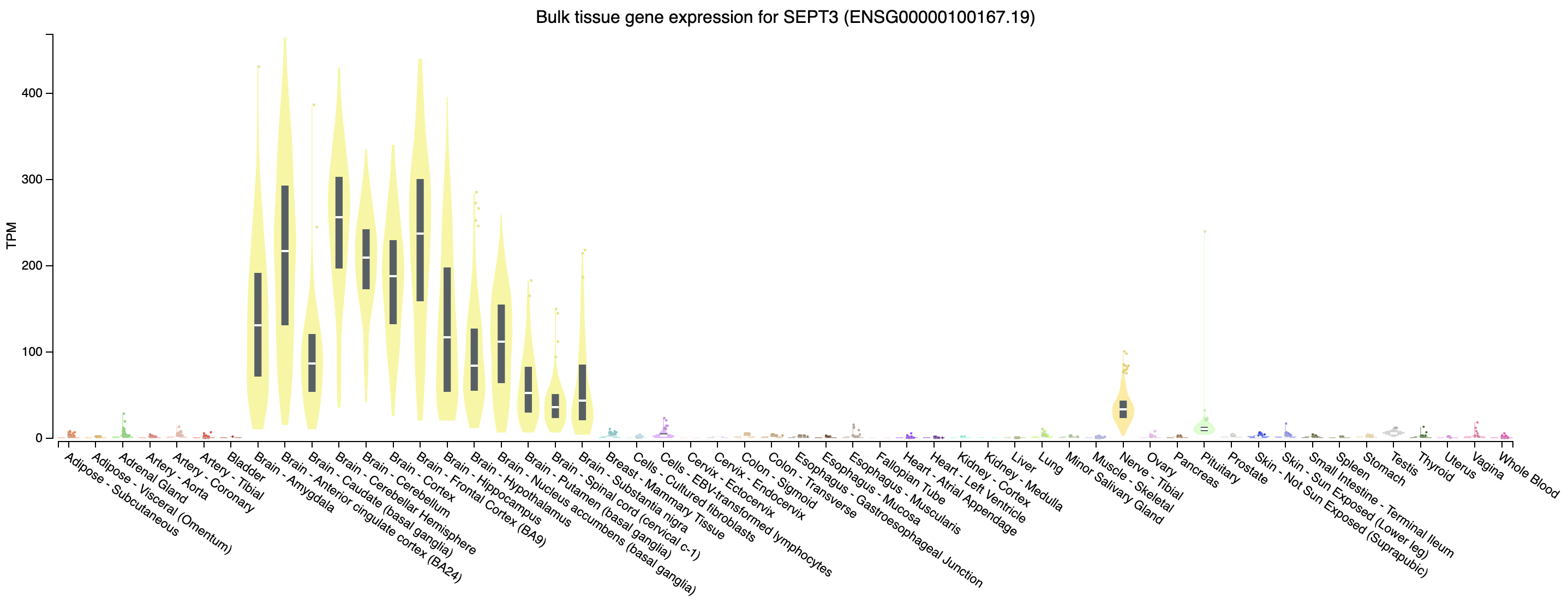 Note that this gene appears to be highly expressed in brain tissues.
Expression of PRAME across tissues according to GTEX
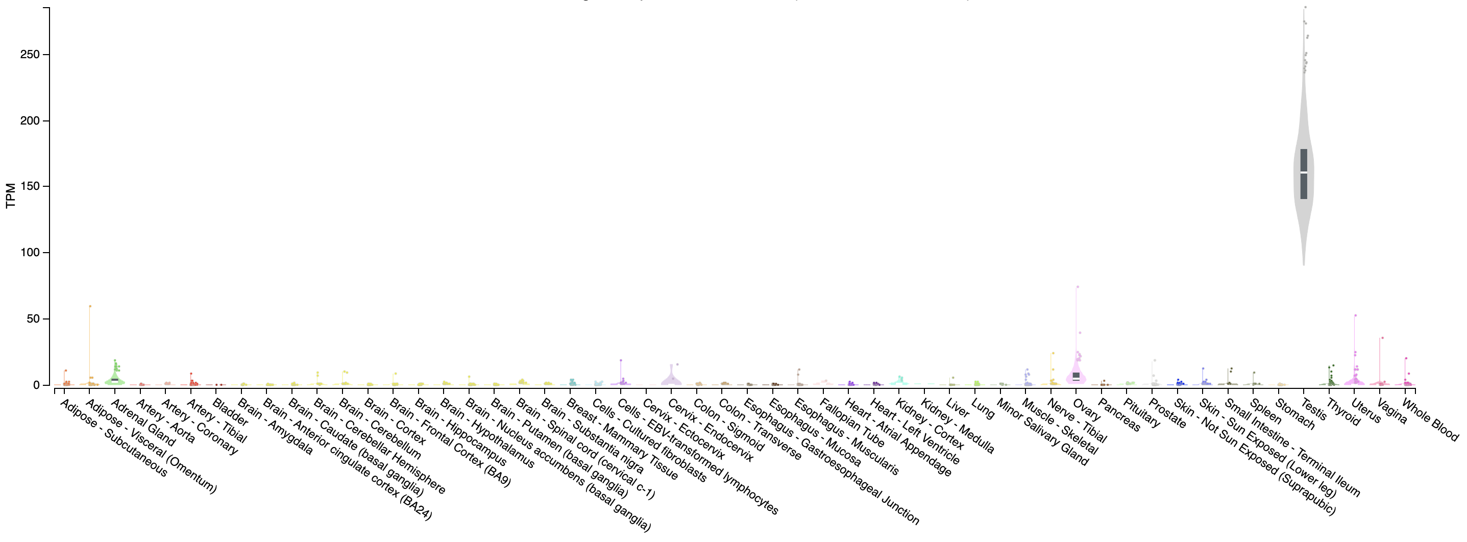 Note that this gene appears to be almost uniquely expressed in testis tissue. Since one of the cell lines in the UHR sample is a testicular cancer cell line, this makes sense.
Assignment: Use R to create a volcano plot for the differentially expressed genes you identified with Ballgown in Practical Exercise 9.
bg.rda) that you should have saved in Practical Exercise 9 as a source of DE results.Solution: When you are ready you can check your approach against the Solutions