Welcome to the blog

Posts

My thoughts and ideas

DE Pathway Analysis | Griffith Lab

RNA-seq Bioinformatics

Introduction to bioinformatics for RNA sequence analysis
DE Pathway Analysis


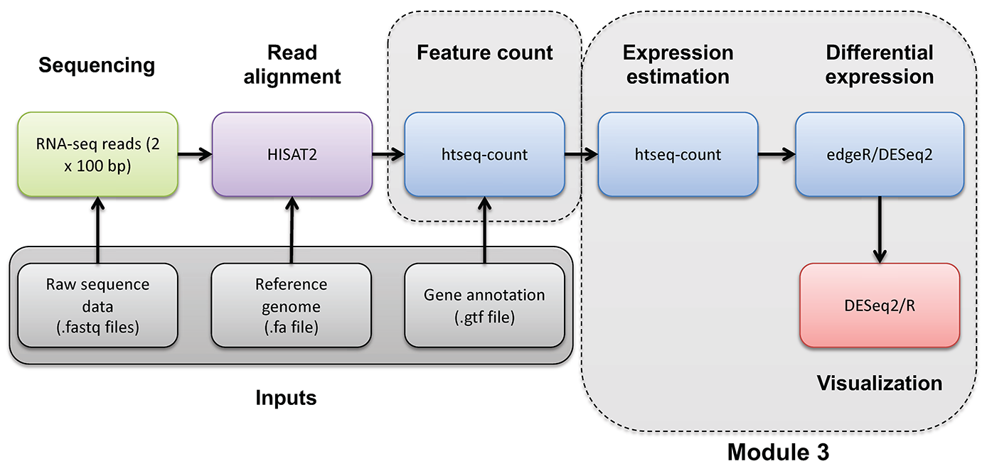
RNA-seq_Flowchart4


In this section we will use the GAGE tool in R to test for significantly enriched sets of genes within those genes found to be significantly “up” and “down” in our UHR vs HBR differential gene expression analysis. Do we see enrichment for genes associated with brain related cell types and processes in the list of DE genes that have significant differential expression beween the UHR samples compared to the HBR samples?

What is gage?

The Generally Applicable Gene-set Enrichment tool (GAGE) is a popular bioconductor package used to perform gene-set enrichment and pathway analysis. The package works independent of sample sizes, experimental designs, assay platforms, and is applicable to both microarray and RNAseq data sets. In this section we will use GAGE and gene sets from the “Gene Ontology” (GO) and the MSigDB databases to perform pathway analysis.

Importing DE results for gage

Before we perform the pathway analysis we need to read in our differential expression results from the previous DE analysis.


# Define working dir paths and load in data
#datadir = "/workspace/rnaseq/de/htseq_counts/deseq2"
datadir = "/cloud/project/outdir/"

setwd(datadir)

# Load in the DE results file with only significant genes (e.g., http://genomedata.org/cri-workshop/deseq2/DE_sig_genes_DESeq2.tsv)
DE_genes = read.table("DE_sig_genes_DESeq2.tsv", sep = "\t", header = TRUE, stringsAsFactors = FALSE)

#output_dir = "/workspace/rnaseq/de/htseq_counts/deseq2/pathway/"
output_dir = "/cloud/project/outdir/pathway/"
if (!dir.exists(output_dir)) {
  dir.create(output_dir, recursive = TRUE)
}

setwd(output_dir)

Now let’s go ahead and load GAGE and some other useful packages.

library(AnnotationDbi)
library(org.Hs.eg.db)
library(GO.db)
library(gage)

Setting up gene set databases

In order to perform our pathway analysis we need a list of pathways and their respective genes. There are many databases that contain collections of genes (or gene sets) that can be used to understand whether a set of mutated or differentially expressed genes are functionally related. Some of these resources include: GO, KEGG, MSigDB, and WikiPathways. For this exercise we are going to investigate GO and MSigDB. The GAGE package has a function for querying GO in real time: go.gsets(). This function takes a species as an argument and will return a list of gene sets and some helpful meta information for subsetting these lists. If you are unfamiliar with GO, it is helpful to know that GO terms are categorized into three gene ontologies: “Biological Process”, “Molecular Function”, and “Cellular Component”. This information will come in handy later in our exercise. GAGE does not provide a similar tool to investigate the gene sets available in MSigDB. Fortunately, MSigDB provides a download-able .gmt file for all gene sets. This format is easily read into GAGE using a function called readList(). If you check out MSigDB you will see that there are 8 unique gene set collections, each with slightly different features. For this exercise we will use the C8 - cell type signature gene sets collection, which is a collection of gene sets that contain cluster markers for cell types identified from single-cell sequencing studies of human tissue.

# Set up go database
go.hs = go.gsets(species = "human")
go.bp.gs = go.hs$go.sets[go.hs$go.subs$BP]
go.mf.gs = go.hs$go.sets[go.hs$go.subs$MF]
go.cc.gs = go.hs$go.sets[go.hs$go.subs$CC]

# Here we will read in an MSigDB gene set that was selected for this exercise and saved to the course website. 
c8 = "http://genomedata.org/rnaseq-tutorial/c8.all.v7.2.entrez.gmt"
all_cell_types = readList(c8)

Annotating genes

OK, so we have our differentially expressed genes and we have our gene sets. However, if you look at one of the objects containing the gene sets you’ll notice that each gene set contains a series of integers. These integers are Entrez gene identifiers. But do we have comparable information in our DE gene list? Right now, no. Our previous results use Ensembl IDs as gene identifiers. We will need to convert our gene identifiers to the format used in the GO and MSigDB gene sets before we can perform the pathway analysis. Fortunately, Bioconductor maintains genome wide annotation data for many species, you can view these species with the OrgDb bioc view. This makes converting the gene identifiers relatively straightforward, below we use the mapIds() function to query the OrganismDb object for the Entrez id based on the Ensembl id. Because there might not be a one-to-one relationship with these identifiers we also use multiVals="first" to specify that only the first identifier should be returned. Another option would be to use multiVals="asNA" to ignore one-to-many mappings.

DE_genes$entrez = mapIds(org.Hs.eg.db, column = "ENTREZID", keys = DE_genes$ensemblID, keytype = "ENSEMBL", multiVals = "first")

Some clean-up and identifier mapping

After completing the annotation above you will notice that some of our Ensembl gene IDs were not mapped to an Entrez gene ID. Why did this happen? Well, this is actually a complicated point and gets at some nuanced concepts of how to define and annotate a gene. The short answer is that we are using two different resources that have annotated the human genome and there are some differences in how these resources have completed this task. Therefore, it is expected that there are some discrepencies. In the next few steps we will clean up what we can by first removing the ERCC spike-in genes and then will use a different identifier for futher mapping.

#Remove spike-in
DE_genes_clean = DE_genes[!grepl("ERCC", DE_genes$ensemblID), ]

##Just so we know what we have removed 
ERCC_gene_count = nrow(DE_genes[grepl("ERCC", DE_genes$ensemblID), ])
ERCC_gene_count

###Deal with genes that we do not have an Entrez ID for 
missing_ensembl_key = DE_genes_clean[is.na(DE_genes_clean$entrez), ]
DE_genes_clean = DE_genes_clean[!DE_genes_clean$ensemblID %in% missing_ensembl_key$ensemblID, ]

###Try mapping using a different key
missing_ensembl_key$entrez = mapIds(org.Hs.eg.db, column = "ENTREZID", keys = missing_ensembl_key$Symbol, keytype = "SYMBOL", multiVal = "first")

#Remove remaining genes 
missing_ensembl_key_update = missing_ensembl_key[!is.na(missing_ensembl_key$entrez),]

#Create a Final Gene list of all genes where we were able to find an Entrez ID (using two approaches)
DE_genes_clean = rbind(DE_genes_clean, missing_ensembl_key_update)

#Reduce to only the unique set of entrez genes in case different genes were mapped to the same entrez ID using the two approaches
DE_genes_clean=DE_genes_clean[!duplicated(DE_genes_clean$entrez),]

Final preparation of DESeq2 results for gage

OK, last step. Let’s format the differential expression results into a format suitable for the GAGE package. Basically this means obtaining the log2 fold change values and assigning entrez gene identifiers to these values.

# grab the log fold changes for everything
De_gene.fc = DE_genes_clean$log2FoldChange

# set the name for each row to be the Entrez Gene ID
names(De_gene.fc) = DE_genes_clean$entrez

Running pathway analysis

We can now use the gage() function to obtain the significantly perturbed pathways from our differential expression experiment.

Note on the abbreviations below: “bp” refers to biological process, “mf” refers to molecular function, and “cc” refers to cellular process. These are the three main categories of gene ontology terms/annotations that were mentioned above.

#Run GAGE
#go 
fc.go.bp.p = gage(De_gene.fc, gsets = go.bp.gs)
fc.go.mf.p = gage(De_gene.fc, gsets = go.mf.gs)
fc.go.cc.p = gage(De_gene.fc, gsets = go.cc.gs)

#msigdb
fc.c8.p = gage(De_gene.fc, gsets = all_cell_types)

###Convert to dataframes 
#Results for testing for GO terms which are up-regulated
fc.go.bp.p.up = as.data.frame(fc.go.bp.p$greater)
fc.go.mf.p.up = as.data.frame(fc.go.mf.p$greater)
fc.go.cc.p.up = as.data.frame(fc.go.cc.p$greater)

#Results for testing for GO terms which are down-regulated
fc.go.bp.p.down = as.data.frame(fc.go.bp.p$less)
fc.go.mf.p.down = as.data.frame(fc.go.mf.p$less)
fc.go.cc.p.down = as.data.frame(fc.go.cc.p$less)

#Results for testing for MSigDB C8 gene sets which are up-regulated
fc.c8.p.up = as.data.frame(fc.c8.p$greater)

#Results for testing for MSigDB C8 gene sets which are down-regulated
fc.c8.p.down = as.data.frame(fc.c8.p$less)

Explore significant results

Alright, now we have results with accompanying p-values (yay!).

What does “up-“ or “down-regulated” mean here, in the context of our UHR vs HBR comparison? It may help to open and review the data in your DE_genes_DESeq2.tsv file.

Look at the cellular process results from our GO analysis. Do the results match your expectation?


#Try doing something like this to find some significant results:
#View the top 20 significantly up- or down-regulated GO terms from the Cellular Component Ontology
head(fc.go.cc.p.up[order(fc.go.cc.p.up$p.val),], n = 20)
head(fc.go.cc.p.down[order(fc.go.cc.p.down$p.val),], n = 20)

#You can do the same thing with your results from MSigDB
head(fc.c8.p.up)
head(fc.c8.p.down)

#What if we want to know which specific genes from our DE gene result were found in a specific significant pathway?
#For example, one significant pathway from fc.go.cc.p.down was "GO:0045202 synapse" with set.size = 22 genes.
#Let's extract the postsynapse DE gene results
synapse = DE_genes_clean[which(DE_genes_clean$entrez %in% go.cc.gs$`GO:0045202 synapse`),]

#How many total synapse genes are there in GO? How many total DE genes? How many overlap?
length(go.cc.gs$`GO:0045202 synapse`)
length(DE_genes_clean$entrez)
length(synapse$entrez)

#Are the synapse DE genes consistently down-regulated? Let's print out a subset of columns from the DE result for synapse genes
synapse[,c("Symbol", "entrez", "log2FoldChange", "padj", "UHR_Rep1", "UHR_Rep2", "UHR_Rep3", "HBR_Rep1", "HBR_Rep2", "HBR_Rep3")]

More exploration

At this point, it will be helpful to move out of R and further explore our results locally. We will use an online tool to visualize how the GO terms we uncovered are related to each other.

write.table(fc.go.cc.p.up, "fc.go.cc.p.up.tsv", quote = FALSE, sep = "\t", col.names = TRUE, row.names = TRUE)
write.table(fc.go.cc.p.down, "fc.go.cc.p.down.tsv", quote = FALSE, sep = "\t", col.names = TRUE, row.names = TRUE)

Visualize

For this next step we will do a very brief introduction to visualizing our results. We will use a tool called GOView, which is part of the WEB-based Gene Set Ananlysis ToolKit (WebGestalt) suite of tools.

Step One

  • Use a web browser to download your results

  • For AWS: Navigate to the URL below replacing YOUR_IP_ADDRESS with your amazon instance IP address: http://YOUR_IP_ADDRESS/rnaseq/de/htseq_counts/deseq2/pathway

  • Download the linked files by right clicking on the two saved result files: fc.go.cc.p.up.tsv and fc.go.cc.p.down.tsv.

  • For posit Cloud: Navigate to the outdir/pathway folder in the ‘Files’ pane. Select fc.go.cc.p.up.tsv and fc.go.cc.p.down.tsv then ‘More’ -> ‘Export…’. You may need to unzip the downloaded files.

  • Open the result file in your text editor of choice. We like text wrangler. You should also be able to open the file in excel, google sheets, or another spreadsheet tool. This might help you visualize the data in rows and columns (NB: There might be a small amount of formatting necessary to get the header to line up properly).

  • You can either create an input file using this file as a guide, or you can simply use your downloaded data to cut and paste your GO terms of interest directly into GOView.

Step Two

Step Three

  • Navigate to the GOView tool

  • Then, input the GO terms you would like to explore into the GOView interface by following the steps described in the “Beginning an analysis” section of the webpage. We will walk through a sample analysis.

  • Explore the outputs!

Alternative Pathway analysis tools and strategies!

At this point, to generate additional visualizations and gain more insight from our enrichment analysis, we can turn to two powerful functions in the clusterProfiler package: gseGO and enrichKEGG. These tools allow us to go beyond simply identifying enriched pathways and give us the ability to visualize and explore these pathways in a much more detailed way.

First, to use gseGO and enrichKEGG effectively, we need a ranked list of DE genes based on their log2 fold change values. This ranked list allows us to analyze and visualize enrichment based on the degree of differential expression, rather than just a binary presence or absence in a pathway.

# Create a named vector of log2 fold changes with Entrez IDs as names
ranked_genes <- setNames(DE_genes_clean$log2FoldChange, DE_genes_clean$entrez)

# Sort the genes by log2 fold change
ranked_genes <- sort(ranked_genes, decreasing = TRUE)

Using gseGO, we can analyze the ranked DE genes list to create classic GSEA enrichment plots. These plots help us see how gene expression levels are distributed across the pathways that were identified as significant in our initial analysis. By examining the ranking of gene expression within these pathways, we can get a clearer picture of how specific pathways are activated or suppressed in our data set.

# Install a package missing from the template
#if (!requireNamespace("BiocManager", quietly = TRUE))
#    install.packages("BiocManager", quiet = TRUE)
#BiocManager::install("pathview", update = FALSE, ask = FALSE, quiet = TRUE)

# Load relevant packages
library(enrichplot)
library(clusterProfiler)
library(pathview)
library(ggnewscale)
library(ggplot2)

gsea_res <- gseGO(
  geneList = ranked_genes,       # Ranked list of genes
  OrgDb = org.Hs.eg.db,          # Specify organism database
  ont = "CC",                    # Use "BP" for Biological Process, "MF" for Molecular Function, "CC" for Cellular Component
  keyType = "ENTREZID",          # Ensure your gene IDs match the key type in OrgDb
  pvalueCutoff = 0.05,           # Set a p-value cutoff for significant pathways
  verbose = TRUE
)

Generate the classic GSEA enrichment plot

# Plot the enrichment plot for a specific GO term or pathway - Synapse
gsea_plot <- gseaplot(gsea_res, geneSetID = "GO:0045202", title = "Enrichment Plot for Synapse")
ggsave("gsea_go_synapse_plot.pdf", plot=gsea_plot, width = 8, height = 8)

We can use additional visualizations, such as dot plots, ridge plots, and concept network plots, to gain further insights into the enriched pathways.

# Dotplot for top GO pathways enriched with DE genes
gsea_dot_plot <- dotplot(gsea_res, showCategory = 30) + ggtitle("GSEA Dotplot - Top 30 GO Categories")
ggsave("gsea_dot_plot.pdf", plot=gsea_dot_plot, width = 8, height = 8)

#Ridgeplot for top GO pathways enriched with DE genes
gsea_ridge_plot <-ridgeplot(gsea_res)
ggsave("gsea_ridge_plot.pdf", plot=gsea_ridge_plot, width = 8, height = 8)

# Concept network plot to illustrate relationships between the top enriched GO terms and DE genes
gsea_cnetplot <- cnetplot(gsea_res, foldChange = ranked_genes, showCategory = 10)
ggsave("gsea_cnetplot.pdf", plot=gsea_cnetplot, width = 8, height = 6)

The enrichKEGG function can be used to visualize KEGG pathways, showing detailed diagrams with our DE genes highlighted. This approach is especially useful for understanding the biological roles of up- and down-regulated genes within specific metabolic or signaling pathways. By using the pathview package, we can generate pathway diagrams where each DE gene is displayed in its functional context and color-coded by expression level. This makes it easy to see which parts of a pathway are impacted and highlights any potential regulatory or metabolic shifts in a clear, intuitive format. We will start by downloading and installing the KEGG database and then run the enrichKEGG function.

# Download KEGG DB file and install
download.file('https://www.bioconductor.org/packages/3.11/data/annotation/src/contrib/KEGG.db_3.2.4.tar.gz', destfile='KEGG.db_3.2.4.tar.gz')
install.packages("KEGG.db_3.2.4.tar.gz", repos = NULL, type = "source")

# Run enrichKEGG with local database option
pathways <- enrichKEGG(gene = names(ranked_genes), organism = "hsa", keyType = "kegg", use_internal_data=TRUE)
head(pathways@result)

Let’s choose one of the pathways above, for example hsa04010 - MAPK signaling pathway to visualize.

# Define the KEGG pathway ID based on above, and run pathview (note this automatically generates and saves plots to your current directory)
pathway_id <- "hsa04010"  # Replace with the KEGG pathway ID of interest
pathview(
  gene.data = ranked_genes,    # DE gene data with Entrez IDs
  pathway.id = pathway_id,  # KEGG pathway ID
  species = "hsa",          # Species code for human
  limit = list(gene = c(-2, 2)),  # Set color scale limits for log2 fold changes
  low = "blue",             # Color for down-regulated genes
  mid = "white",            # Color for neutral genes
  high = "red"              # Color for up-regulated genes
)

#To exit R type:
quit(save = "no")
DE Visualization Advanced | Griffith Lab

RNA-seq Bioinformatics

Introduction to bioinformatics for RNA sequence analysis

DE Visualization Advanced


RNA-seq_Flowchart4


Supplementary R DE Visualization

Occasionally you may wish to reformat and work with expression estimates in R in an ad hoc way. Here, we provide an optional/advanced tutorial on how to visualize your results for R and perform “old school” (non-ballgown, non-DESeq2) visualization of your data.

In this tutorial you will:

Expression and differential expression files will be read into R. The R analysis will make use of the gene-level expression estimates from HISAT2/Stringtie (TPM values) and differential expression results from HISAT2/htseq-count/DESeq2 (fold-changes and p-values).

Start RStudio, or launch a posit Cloud session, or if you are using AWS, navigate to the correct directory and then launch R:

First you’ll load your libraries and your data.

#Load your libraries
library(ggplot2)
library(gplots)
library(GenomicRanges)
library(ggrepel)

#Set a base working directory
setwd("/cloud/project/")

#Import expression results (TPM values) from the HISAT2/Stringtie pipeline (https://genomedata.org/cri-workshop/gene_tpm_all_samples.tsv)
#gene_expression = read.table("~/workspace/rnaseq/expression/stringtie/ref_only/gene_tpm_all_samples.tsv", header = TRUE, stringsAsFactors = FALSE, row.names = 1)
gene_expression = read.table("data/bulk_rna/gene_tpm_all_samples.tsv", header = TRUE, stringsAsFactors = FALSE, row.names = 1)

#Import gene name mapping file (https://genomedata.org/cri-workshop/ENSG_ID2Name.txt)
#gene_names=read.table("~/workspace/rnaseq/de/htseq_counts/ENSG_ID2Name.txt", header = FALSE, stringsAsFactors = FALSE)
gene_names=read.table("data/bulk_rna/ENSG_ID2Name.txt.gz", header = FALSE, stringsAsFactors = FALSE)

colnames(gene_names) = c("gene_id", "gene_name")

#Import DE results from the HISAT2/htseq-count/DESeq2 pipeline (http://genomedata.org/cri-workshop/deseq2/DE_all_genes_DESeq2.tsv)
#results_genes = read.table("~/workspace/rnaseq/de/htseq_counts/deseq2/DE_all_genes_DESeq2.tsv", sep = "\t", header = TRUE, stringsAsFactors = FALSE)
results_genes = read.table("outdir/DE_all_genes_DESeq2.tsv", sep = "\t", header = TRUE, stringsAsFactors = FALSE)

#Set a directory for the output to go to
 output_dir = "/cloud/project/outdir/visualization_advanced/"
 if (!dir.exists(output_dir)) {
   dir.create(output_dir, recursive = TRUE)
 }
 setwd(output_dir)

Let’s briefly explore the imported data


#### Working with 'dataframes'
#View the first five rows of data (all columns) in the gene_expression (Stringtie TPM) dataframe
head(gene_expression)

#View the column names
colnames(gene_expression)

#View the row names
row.names(gene_expression)

#Determine the dimensions of the dataframe.  'dim()' will return the number of rows and columns
dim(gene_expression)

#Get the first 3 rows of data and a selection of columns
gene_expression[1:3, c(1:3, 6)]

#Do the same thing, but using the column names instead of numbers
gene_expression[1:3, c("HBR_Rep1", "HBR_Rep2", "HBR_Rep3", "UHR_Rep3")]

#Now, exlore the differential expression (DESeq2 results) 
head(results_genes)
dim(results_genes)

#Assign some colors for use later.  You can specify color by RGB, Hex code, or name
#To get a list of color names:
colours()
data_colors = c("tomato1", "tomato2", "tomato3", "royalblue1", "royalblue2", "royalblue3")

The following code blocks are to generate various plots using the above data set.


#### Plot #1 - View the range of values and general distribution of TPM values for all 6 libraries
#Create boxplots for this purpose
#Display on a log2 scale and set a minimum non-zero value to avoid log2(0)
min_nonzero = 1

# Set the columns for finding TPM and create shorter names for figures
data_columns = c(1:6)
short_names = c("HBR_1", "HBR_2", "HBR_3", "UHR_1", "UHR_2", "UHR_3")

pdf(file = "All_samples_TPM_boxplots.pdf")
boxplot(log2(gene_expression[, data_columns] + min_nonzero), col = data_colors, names = short_names, las = 2, ylab = "log2(TPM)", main = "Distribution of TPMs for all 6 libraries")
#Note that the bold horizontal line on each boxplot is the median
dev.off()

#### Plot #2 - plot a pair of replicates to assess reproducibility of technical replicates
#Tranform the data by converting to log2 scale after adding an arbitrary small value to avoid log2(0)
x = gene_expression[, "UHR_Rep1"]
y = gene_expression[, "UHR_Rep2"]
pdf(file = "UHR_Rep1_vs_Rep2_scatter.pdf")
plot(x = log2(x + min_nonzero), y = log2(y + min_nonzero), pch = 16, col = "blue", cex = 0.25, xlab = "TPM (UHR, Replicate 1)", ylab = "TPM (UHR, Replicate 2)", main = "Comparison of expression values for a pair of replicates")

#Add a straight line of slope 1, and intercept 0
abline(a = 0, b = 1)

#Calculate the correlation coefficient and display in a legend
rs = cor(x, y)^2
legend("topleft", paste("R squared = ", round(rs, digits = 3), sep = ""), lwd = 1, col = "black")
dev.off()

#### Plot #3 - Scatter plots with a large number of data points can be misleading ... regenerate this figure as a density scatter plot
pdf(file = "UHR_Rep1_vs_Rep2_SmoothScatter.pdf")
colors = colorRampPalette(c("white", "blue", "#007FFF", "cyan","#7FFF7F", "yellow", "#FF7F00", "red", "#7F0000"))
smoothScatter(x = log2(x + min_nonzero), y = log2(y + min_nonzero), xlab = "TPM (UHR, Replicate 1)", ylab = "TPM (UHR, Replicate 2)", main = "Comparison of expression values for a pair of replicates", colramp = colors, nbin = 200)
dev.off()

#### Plot #4 - Scatter plots of all sets of replicates on a single plot
#Create a function that generates an R plot.  This function will take as input the two libraries to be compared and a plot name
plotCor = function(lib1, lib2, name){
	x = gene_expression[, lib1]
	y = gene_expression[, lib2]
	colors = colorRampPalette(c("white", "blue", "#007FFF", "cyan", "#7FFF7F", "yellow", "#FF7F00", "red", "#7F0000"))
	smoothScatter(x = log2(x + min_nonzero), y = log2(y + min_nonzero), xlab = lib1, ylab = lib2, main = name, colramp = colors, nbin = 275)
	abline(a = 0, b = 1)
        zero_count = length(which(x == 0)) + length(which(y == 0))
	rs = cor(x, y, method = "pearson")^2
	legend_text = c(paste("R squared = ", round(rs, digits = 3), sep=""), paste("Zero count = ", zero_count, sep = ""))
	legend("topleft", legend_text, lwd = c(1, NA), col = "black", bg = "white", cex = 0.8)
}

#Now make a call to our custom function created above, once for each library comparison
pdf(file = "UHR_All_Reps_SmoothScatter.pdf")
par(mfrow = c(1, 3))
plotCor("UHR_Rep1", "UHR_Rep2", "UHR_1 vs UHR_2")
plotCor("UHR_Rep2", "UHR_Rep3", "UHR_2 vs UHR_3")
plotCor("UHR_Rep1", "UHR_Rep3", "UHR_1 vs UHR_3")

dev.off()

#### Compare the correlation between all replicates
#Do we see the expected pattern for all eight libraries (i.e. replicates most similar, then tumor vs. normal)?

#Calculate the TPM sum for all 6 libraries
gene_expression[,"sum"] = apply(gene_expression[,data_columns], 1, sum)

#Identify the genes with a grand sum TPM of at least 5 - we will filter out the genes with very low expression across the board
i = which(gene_expression[,"sum"] > 5)

#Calculate the correlation between all pairs of data
r = cor(gene_expression[i,data_columns], use = "pairwise.complete.obs", method = "pearson")

#Print out these correlation values
r


#### Plot #5 - Convert correlation to 'distance', and use 'multi-dimensional scaling' to display the relative differences between libraries
#This step calculates 2-dimensional coordinates to plot points for each library
#Libraries with similar expression patterns (highly correlated to each other) should group together
#What pattern do we expect to see, given the types of libraries we have (technical replicates, biologal replicates, tumor/normal)?
pdf(file = "UHR_vs_HBR_MDS.pdf")
d = 1 - r
mds = cmdscale(d, k = 2, eig = TRUE)
par(mfrow = c(1,1))
plot(mds$points, type = "n", xlab = "", ylab = "", main = "MDS distance plot (all non-zero genes)", xlim = c(-0.12, 0.12), ylim = c(-0.12, 0.12))
points(mds$points[, 1], mds$points[, 2], col = "grey", cex = 2, pch = 16)
text(mds$points[, 1], mds$points[, 2], short_names, col = data_colors)
dev.off()


#### Plot #6 - View the distribution of differential expression values as a histogram
#Display only those results that are significant according to DESeq2 (loaded above)
pdf(file = "UHR_vs_HBR_DE_FC_distribution.pdf")
sig = which(results_genes$pvalue < 0.05)
hist(results_genes[sig, "log2FoldChange"], breaks = 50, col = "seagreen", xlab = "log2(Fold change) UHR vs HBR", main = "Distribution of differential expression values")
abline(v = -2, col = "black", lwd = 2, lty = 2)
abline(v = 2, col = "black", lwd = 2, lty = 2)
legend("topleft", "Fold-change > 2", lwd = 2, lty = 2)
dev.off()

#### Plot #7 - Display the mean expression values from UHR and HBR and mark those that are significantly differentially expressed
pdf(file="UHR_vs_HBR_mean_TPM_scatter.pdf")

gene_expression[, "HBR_mean"] = apply(gene_expression[,c(1:3)], 1, mean)
gene_expression[, "UHR_mean"] = apply(gene_expression[,c(4:6)], 1, mean)

x = log2(gene_expression[, "UHR_mean"] + min_nonzero)
y = log2(gene_expression[, "HBR_mean"] + min_nonzero)
plot(x = x, y = y, pch = 16, cex = 0.25, xlab = "UHR TPM (log2)", ylab = "HBR TPM (log2)", main = "UHR vs HBR TPMs")
abline(a = 0, b = 1)
xsig = x[sig]
ysig = y[sig]
points(x = xsig, y = ysig, col = "magenta", pch = 16, cex = 0.5)
legend("topleft", "Significant", col = "magenta", pch = 16)

#Get the gene symbols for the top N (according to corrected p-value) and display them on the plot
topn = order(results_genes[sig,"padj"])[1:25]
text(x[topn], y[topn], results_genes[topn, "Symbol"], col = "black", cex = 0.75, srt = 45)

dev.off()

#### Plot #8 - Create a heatmap to vizualize expression differences between the six samples
#Define custom dist and hclust functions for use with heatmaps
mydist = function(c) {dist(c, method = "euclidian")}
myclust = function(c) {hclust(c, method = "average")}

#Create a subset of significant genes with p-value<0.05 and log2 fold-change >= 2
sigpi = which(results_genes[, "pvalue"] < 0.05)
sigp = results_genes[sigpi, ]
sigfc = which(abs(sigp[, "log2FoldChange"]) >= 2)
sigDE = sigp[sigfc, ]

pdf(file = "UHR_vs_HBR_heatmap.pdf")
main_title = "sig DE Genes"
par(cex.main = 0.8)
sigDE_genes = sigDE[, "ensemblID"]
sigDE_genenames = sigDE[, "Symbol"]

data = log2(as.matrix(gene_expression[as.vector(sigDE_genes), data_columns]) + 1)
heatmap.2(data, hclustfun = myclust, distfun = mydist, na.rm = TRUE, scale = "none", dendrogram = "both", margins = c(10,4), Rowv = TRUE, Colv = TRUE, symbreaks = FALSE, key = TRUE, symkey = FALSE, density.info = "none", trace = "none", main = main_title, cexRow = 0.3, cexCol = 1, labRow = sigDE_genenames, col = rev(heat.colors(75)))
dev.off()

#### Plot #9 - Volcano plot

# Set differential expression status for each gene - default all genes to "no change"
results_genes$diffexpressed = "No"

# if log2Foldchange > 2 and padj < 0.05, set as "Up regulated"
results_genes$diffexpressed[results_genes$log2FoldChange >= 2 & results_genes$padj < 0.05] = "Higher in UHR"

# if log2Foldchange < -2 and padj < 0.05, set as "Down regulated"
results_genes$diffexpressed[results_genes$log2FoldChange <= -2 & results_genes$padj < 0.05] = "Higher in HBR"

# write the gene names of those significantly upregulated/downregulated to a new column
results_genes$gene_label = NA
results_genes$gene_label[results_genes$diffexpressed != "No"] = results_genes$Symbol[results_genes$diffexpressed != "No"]

pdf(file = "UHR_vs_HBR_volcano.pdf")

ggplot(data = results_genes[results_genes$diffexpressed != "No",], aes(x = log2FoldChange, y = -log10(padj), label = gene_label, color = diffexpressed)) +
  xlab("log2Foldchange") +
  scale_color_manual(name = "Differentially expressed", values=c("blue", "red")) +
  geom_point() +
  theme_minimal() +
  geom_text_repel() +
  geom_vline(xintercept = c(-2.0, 2.0), col = "black", linetype = "dotted") +
  geom_hline(yintercept = -log10(0.05), col = "black", linetype = "dotted") +
  guides(colour = guide_legend(override.aes = list(size=5))) +
  geom_point(data = results_genes[results_genes$diffexpressed == "No",], aes(x = log2FoldChange, y = -log10(padj)), colour = "black")

dev.off()

#To exit R type:
quit(save = "no")

The output file can be viewed in your browser at the following url. Note, you must replace YOUR_PUBLIC_IPv4_ADDRESS with your own amazon instance IP (e.g., 101.0.1.101)).

Visual comparison of example genes from the volcano plot

One can manually explore interesting looking genes from the volcano plot. In this case our analysis involves comparison of RNA isolated from tissues of different types (HBR -> brain tissue, UHR -> a collection of cancer cell lines). So, in this analysis it might make sense to explore candidates in a tissue expression atlas such as GTEX.

Looking at our gene plot, two example genes we could look at are: SEPT3 (significantly higher in HBR) and PRAME (significantly higher in UHR).

Expression of SEPT3 across tissues according to GTEX SEPT3 Note that this gene appears to be highly expressed in brain tissues.

Expression of PRAME across tissues according to GTEX PRAME Note that this gene appears to be almost uniquely expressed in testis tissue. Since one of the cell lines in the UHR sample is a testicular cancer cell line, this makes sense.


PRACTICAL EXERCISE 10 (ADVANCED)

Assignment: Use R to create a volcano plot for the differentially expressed genes you identified with Ballgown in Practical Exercise 9.

Solution: When you are ready you can check your approach against the Solutions