Welcome to the blog

Posts

My thoughts and ideas

Differential Expression AI Exercise | Griffith Lab

RNA-seq Bioinformatics

Introduction to bioinformatics for RNA sequence analysis

Differential Expression AI Exercise


RNA-seq_Flowchart4


DE Analysis. AI exercise

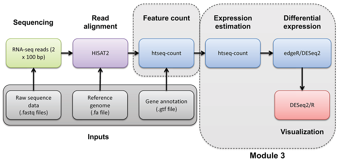
In this tutorial you will:

  • Experiment with use of AI tools to perform a differential expression analysis
  • Consider alternative approaches, best practices, pitfalls for use of AI for such work
  • Share prompts and compare results with your colleagues

Complete a Google form as you go through this exercise

We will use a google form to capture basic information about AI tool choice (and model version), AI prompts used, etc. Refer to the course slack channel for a link to this form.

Outline of the exercise

For this exercise we want you to imagine that you did not have the previous section as a guide on how to perform a differential expression analysis in R. Imagine that you obtained the gene counts matrix “gene_read_counts_table_all_final.tsv” from your sequencing core, a collaborator, or a public source. See if you can complete a DE analysis like the one you just completed, step-by-step, but using an AI assistant. Here is an overview of the basic steps (more details on each below):

  1. In your R session, locate the input data and define a location for results
  2. Choose an AI tool and make note of the model used (record your choice in the Google form)
  3. Develop your initial prompt to the AI (record your prompt in the Google form)
  4. With help from the AI create a differential expression analysis in R and run it.
  5. Answer a few specific questions (top DE genes and summary of # of significant genes) and produce a visualization (volcano plot) for comparison of results to your colleagues.

1. Input data and output location

For the exercise use the following:

  • Input gene expression counts data file path: /home/ubuntu/workspace/rnaseq/expression/htseq_counts/gene_read_counts_table_all_final.tsv
  • Gene ID to name mapping file path: /home/ubuntu/workspace/rnaseq/de/ENSG_ID2Name.txt.gz
  • Results path: /home/ubuntu/workspace/rnaseq/de_ai_exercise

Hint. To quickly see what the input data looks like, you can do the following to display the first two lines of each:

head(read.delim("/home/ubuntu/workspace/rnaseq/expression/htseq_counts/gene_read_counts_table_all_final.tsv"), n=2)
head(read.delim("/home/ubuntu/workspace/rnaseq/de/ENSG_ID2Name.txt"), n=2)

2. Choice of AI tool

There are several broad approaches to using AI for bioinformatics analysis, and your choice of tool will shape how the interaction unfolds. The main paradigms are:

  • Conversational AI assistants. You interact with the AI through a chat interface, describing your task in plain language and exchanging messages back and forth. You paste in data snippets or describe your files, and the AI generates code or explanations in response. This is the most accessible entry point and requires no special software setup.

  • Integrated development environment (IDE) and command line interface (CLI) AI coding tools. Some development environments embed AI assistance directly into the coding workflow. The AI can see your open files, suggest completions inline, explain errors in context, and generate code without leaving the editor or commandline. This tighter integration can make iteration faster but requires a compatible editor/tool.

  • Locally-run open models. Open-weight language models can be run on your own machine, which avoids sending data to external servers (relevant when working with sensitive or unpublished data). These require more setup and capable hardware, and are generally less capable than leading commercial models at time of writing.

Note that given the cloud-based R/RStudio environment used in this course, the conversational assistant approach is the most practical. Using this approach you can work in a browser tab alongside your R or RStudio session with no additional setup. The IDE-integrated approach is possible but would require downloading the input data files to your laptop. Locally-run models are beyond the scope of this exercise.

For this exercise, use whichever AI tool you are comfortable with, or take the opportunity to try one you have heard about but not used before, or simply pick one from the list below. A few commonly used options across these categories:

Tool Type Provider
ChatGPT Conversational OpenAI
Claude Conversational Anthropic
Gemini Conversational Google
Microsoft Copilot Conversational Microsoft
GitHub Copilot IDE-based Microsoft/GitHub
Cursor IDE-based Cursor
Claude Code CLI-based Anthropic
Codex CLI-based OpenAI
Ollama Local models Meta (open weight)
Qwen Local models Alibaba (open weight)
DeepSeek Local models deepseek (open weight)

Make note of both the tool and the specific model version you use (e.g. GPT-4o, Claude Sonnet 3.7, Gemini 2.0 Flash). Model versions vary significantly in capability and the field moves quickly. Record your choice in the Google form.

3. Develop initial prompt

Before starting, take a few minutes to think about what you will tell the AI. A well-constructed prompt is likely to produce more useful code than a vague one, and the differences across students will make for a rich comparison later. You do not need to craft a perfect prompt! Part of the point of this exercise is to see what happens with different approaches.

As you draft your prompt, consider what information the AI would need to produce useful, runnable code. Some dimensions to think about (without being told exactly what to include):

  • The goal. What kind of analysis do you want? What output would you consider a success?
  • The data. What does the input file look like? How is it structured? What do the rows and columns represent? You may want to paste a small excerpt so the AI can see the format directly.
  • The experimental design. The AI has no way to know which samples belong to which condition unless you tell it. How would you convey this?
  • Tool or method preference. There are several well-established R packages for differential expression analysis. Do you want to specify one, or let the AI choose? Does it matter?
  • Filtering and quality considerations. Raw count matrices often contain genes with very low or zero counts across samples. Do you want the AI to handle this, and if so, how?
  • Output and thresholds. What criteria define a “differentially expressed” gene for your purposes? What visualizations or result files would be useful?

Write your initial prompt, then record it in the Google form before sending it to the AI. You may refine it through the conversation.

4. Complete the differential expression analysis

Enter your prompt into the AI tool of your choice and examine the response carefully before running anything. Consider:

  • Does the response make sense at a high level? Does the AI seem to have understood your goal?
  • What assumptions did it make: about the data format, the experimental design, the choice of method, filtering strategy, or significance thresholds? Are those assumptions correct?
  • Are there obvious errors or things that seem off?
  • Do you feel the initial response is complete enough to run, or do you want to refine it with follow-up prompts before proceeding?

Iterate with the AI as needed. When you are satisfied, copy the code into your cloud R environment and execute it line by line. At each step, inspect the output and try to understand what the code is doing before moving on. If something fails or produces unexpected results, you may go back to the AI to debug.

Record your answers to the above questions, along with any significant follow-up prompts, in the Google form.

5. Evaluate the outcome

Before wrapping up, make sure your analysis produces results that address the following. These are the questions you will answer in the Google form and the basis for class discussion:

  • Top DE genes. What are the top differentially expressed genes in each direction (upregulated and downregulated)? Report gene names, fold changes, and adjusted p-values.
  • Summary statistics. How many genes were tested? How many pass your significance threshold (both in total and broken down by direction)?
  • Volcano plot. Produce a volcano plot with the top genes labeled. Make sure it is clean enough to share — axis labels, a title, and clear highlighting of significant genes.

Record your answers in the Google form and save your volcano plot image to your results directory. Be prepared to share it for class discussion. The variation across students in both results and plot appearance will be part of what we examine together.

6. Further reading and exploration

The following resources are starting points for deepening your understanding of the concepts touched on in this exercise. This is a fast-moving area. Treat these as entry points rather than definitive answers.

Comparing and choosing AI tools

  • The LMSYS Chatbot Arena leaderboard provides crowd-sourced, head-to-head comparisons of language models across a wide range of tasks and is one of the most widely cited independent benchmarks for conversational AI.
  • Most major providers publish their own model capability summaries and release notes. These may be worth checking when new versions are released, as capabilities can change substantially between versions.

Prompt engineering

  • The Prompt Engineering Guide (DAIR.AI) is a comprehensive, open community resource covering core techniques.
  • Most AI providers also publish their own prompting guides. Anthropic’s guide and OpenAI’s guide are both readable and practical.
  • Key concepts to explore further: chain-of-thought prompting, use of examples (zero-shot, one-shot, few-shot, many-shot), role assignment, context engineering (account settings, project config files, system prompts, and other techniques that automatically influence every interaction with the AI), and finally how to iteratively refine prompts based on output quality.

Critical evaluation and responsible use

  • Hallucination is the tendency of language models to generate plausible-sounding but factually incorrect information. This may include for example: fabricated function names, wrong default parameters, and non-existent R packages.
  • Reproducibility is a growing concern when AI-generated code is used in scientific analysis. The same prompt can produce different code on different days or with different model versions. Document your prompts, the model and version used, and the code that was actually run (not just the final result).
  • Data privacy. Commercial AI tools send your input to external servers. For unpublished data, sensitive patient data, or data under a data use agreement, verify the terms of service before sharing anything. Many institutions have policies on this.
  • Search for recent perspectives on “LLMs in scientific research reproducibility” and “AI-generated code reliability” for ongoing community discussion of these issues.

AI tools for bioinformatics and data science

  • The use of LLMs for bioinformatics tasks such as code generation, literature summarization, and experimental design is an active research area. Search “large language models bioinformatics” in PubMed or Google Scholar for recent reviews and benchmarks.
  • Evaluation papers comparing how well models handle statistical analysis, R code generation, and genomics tasks are beginning to appear and are worth tracking.
  • Community forums such as Biostars and Bioconductor support forums increasingly include discussions of AI-assisted workflows and how people are actually using these tools.
Batch Correction Analysis | Griffith Lab

RNA-seq Bioinformatics

Introduction to bioinformatics for RNA sequence analysis

Batch Correction Analysis


RNA-seq_Flowchart4


In this section we will use the ComBat-Seq tool in R (Bioconductor) to demonstrate the principles and application of batch correction. Due to the way our test data was generated (at a single center, at one time, with consistent methodology) we do NOT expect batch effects in these data. Therefore we will use a different (but highly related) dataset to demonstrate the impact of Batch correction in this module.

Introduction to batch correction

We highly recommend reading the entire ComBat-Seq manuscript by Yuqing Zhang, Giovanni Parmigiani, and W Evan Johnson. This manuscript does a beautiful job of briefly introducing the concept of batch correction and the differences between normalization and batch correction. If you find this exercise helpful in your research, please cite the ComBat-Seq paper (PMID: 33015620).

In particular, this excerpt covers the basics:

Genomic data are often produced in batches due to logistical or practical restrictions, but technical variation and differences across batches, often called batch effects, can cause significant heterogeneity across batches of data. Batch effects often result in discrepancies in the statistical distributions across data from different technical processing batches, and can have unfavorable impact on downstream biological analysis … Batch effects often cannot be fully addressed by normalization methods and procedures. The differences in the overall expression distribution of each sample across batch may be corrected by normalization methods, such as transforming the raw counts to (logarithms of) CPM, TPM or RPKM/FPKM, the trimmed mean of M values (TMM), or relative log expression (RLE). However, batch effects in composition, i.e. the level of expression of genes scaled by the total expression (coverage) in each sample, cannot be fully corrected with normalization. … While the overall distribution of samples may be normalized to the same level across batches, individual genes may still be affected by batch-level bias.

Introduction to this demonstration of a batch correction approach

For this exercise we have obtained public RNA-seq data from an extensive multi-platform comparison of sequencing platforms that also examined the impact of: (1) generating data at multiple sites, (2) using polyA vs ribo-reduction for enrichment, and (3) different levels of RNA degradation (PMID: 25150835): “Multi-platform and cross-methodological reproducibility of transcriptome profiling by RNA-seq in the ABRF Next-Generation Sequencing Study”.

This publication used the same UHR (cancer cell lines) and HBR (brain tissue) samples we have been using throughout this course. To examine a strong batch effect, we will consider a DE analysis of UHR vs HBR where we compare Ribo-depleted (“Ribo”) and polyA-enriched (“Poly”) samples.

Questions If we do DE analysis of UHR vs. HBR for replicates that are consistent with respect to Ribo-depletion or PolyA-enrichment, how does the result compare to when we mix the Ribo-depleted data and PolyA-enriched data together?

If you do batch correction and redo these comparisons does it make the results more comparable? i.e. can we correct for the technical differences introduced by the library construction approach and see the same biological differences? Can we improve our statistical power by then benefitting from more samples?

This is a bit contrived because there really are true biological differences expected for polyA vs. Ribo-depleted data. To counter this, we will limit the analysis to only know protein coding genes. For those genes we expect essentially the same biological answer when comparing UHR vs HBR expression patterns.

This exercise is also a bit simplistic in the sense that we have perfectly balanced conditions and batches. Our conditions of interest are: HBR (brain) vs. UHR (cancer cell line) expression patterns. Our batches are the two methods of processing: Riboreduction and PolyA enrichment. And we have 4 replicates of both conditions in both batches. To perform this kind of batch correction you need at least some representation of each of your conditions of interest in each batch. So, for example, if we processed all the HBR samples with Riboreduction and all the UHR samples with PolyA enrichment, we would be unable to model the batch effect vs the condition effect.

There are also other experiments from this published dataset we could use instead. For example, different levels of degradation?, data generated by different labs? Figure 1 and Figure 2 give a nice high level summary of all the data generated. We chose the Ribo-reduction and PolyA enrichment data for this exercise because we expect this would introduce a very strong batch effect. It is also the kind of thing that one could imagine really coming up in a meta-analysis where one you are pooling data from multiple studies. For example, imagine we find three published studies from three labs that all assayed some number of normal breast tissue and breast tumor. Each used a different approach to generate their data but they all involved this same biological comparison and by combining the three datasets we hope to substantially increase our power. If we can correct for batch effects arising from the three labs, this may be successful.

Samples abbreviations used in the following analysis

Perform principal component analysis (PCA) on the uncorrected counts

PCA analysis can be used to identify potential batch effects in your data. The general strategy is to use PCA to identify patterns of similarity/difference in the expression signatures of your samples and to ask whether it appears to be driven by the expected biological conditions of interest. The PCA plot can be labeled with the biological conditions and also with potential sources of batch effects such as: sequencing source, date of data generation, lab technician, library construction kit batches, matrigel batches, mouse litters, software or instrumentation versions, etc.

Principal component analysis is a dimensionality-reduction method that can be applied to large datasets (e.g. thousands of gene expression values for many samples). PCA tries to represent a large set of variables as a smaller set of variables that maximally capture the information content of the larger set. PCA is a general exploratory data analysis approach with many applications and nuances, the details of which are beyond the scope of this demonstration of batch effect correction. However, in the context of this module, PCA provides a way to visualize samples as “clusters” based on their overall pattern of gene expression values. The composition and arrangement of these clusters (usually visualized in 2D or interactive 3D plots) can be helpful in interpreting high level differences between samples and testing prior expectations about the similarity between conditions, replicates, etc.

We will perform PCA analysis before AND after batch correction. Samples will be labelled according to biological condition (UHR vs HBR) and library preparation type (Ribo vs PolyA).

Does the analysis below suggest that sample grouping according to PCA is being influenced by batch?

Perform the following analyses in R:


#Define working dir paths
# datadir = "/cloud/project/data/bulk_rna"
# outdir = "/cloud/project/outdir"

datadir = "~/workspace/rnaseq/batch_correction"
outdir = "~/workspace/rnaseq/batch_correction/outputs"

if (!dir.exists(outdir)) dir.create(outdir)

#load neccessary libraries
library("sva") #Note this exercise requires sva (>= v3.36.0) which is only available for R (>= v4.x)
library("ggplot2")
library("gridExtra")
library("edgeR")
library("UpSetR")
library(grid)

#load in the uncorrected data as raw counts
setwd(datadir)
uncorrected_data = read.table("GSE48035_ILMN.Counts.SampleSubset.ProteinCodingGenes.tsv", header = TRUE, sep = "\t", as.is = c(1,2))
setwd(outdir)

#simplify the names of the data columns
# (A = Universal Human Reference RNA and B = Human Brain Reference RNA)
# RNA = polyA enrichment and RIBO = ribosomal RNA depletion
# 1, 2, 3, 4 are replicates
names(uncorrected_data) = c("Gene", "Chr", "UHR_Ribo_1", "UHR_Ribo_2", "UHR_Ribo_3", "UHR_Ribo_4", "HBR_Ribo_1", "HBR_Ribo_2", "HBR_Ribo_3", "HBR_Ribo_4", 
                            "UHR_Poly_1", "UHR_Poly_2", "UHR_Poly_3", "UHR_Poly_4", "HBR_Poly_1", "HBR_Poly_2", "HBR_Poly_3", "HBR_Poly_4")
sample_names = names(uncorrected_data)[3:length(names(uncorrected_data))]

#review data structure
head(uncorrected_data)
dim(uncorrected_data)

#define conditions, library methods, and replicates
conditions = c("UHR", "UHR", "UHR", "UHR", "HBR", "HBR", "HBR", "HBR", "UHR", "UHR", "UHR", "UHR", "HBR", "HBR", "HBR", "HBR")
library_methods = c("Ribo", "Ribo", "Ribo", "Ribo", "Ribo", "Ribo", "Ribo", "Ribo", "Poly", "Poly", "Poly", "Poly", "Poly", "Poly", "Poly", "Poly")
replicates = c(1, 2, 3, 4, 1, 2, 3, 4, 1, 2, 3, 4, 1, 2, 3, 4)

#Create a counts per million (CPM) version of the uncorrected data to use just for the PCA analysis
#we do this because we don't want the variable amount of data generated for each sample to influence the PCs
#extract the count matrix, calculate CPM, rebuild the full dataframe with Gene and Chr columns
count_matrix = uncorrected_data[, sample_names]
lib_sizes = colSums(count_matrix)
cpm_matrix = sweep(count_matrix, 2, lib_sizes, FUN = "/") * 1e6
uncorrected_data_cpm = cbind(uncorrected_data[, c("Gene", "Chr")], cpm_matrix)

#calculate principal components for the uncorrected data
pca_uncorrected_obj = prcomp(uncorrected_data_cpm[,sample_names])

#pull PCA values out of the PCA object
pca_uncorrected = as.data.frame(pca_uncorrected_obj[2]$rotation)

#determine the percentage of variance explained by each PC
variance = (pca_uncorrected_obj$sdev)^2
percent_variance = (variance / sum(variance)) * 100

#assign labels to the data frame
pca_uncorrected[,"condition"] = conditions
pca_uncorrected[,"library_method"] = library_methods
pca_uncorrected[,"replicate"] = replicates

#plot the PCA
#create a classic 2-dimension PCA plot (first two principal components) with conditions and library methods indicated
pc1_label = paste("PC1 (", round(percent_variance[1], digits=1), "% variance explained)", sep="")
pc2_label = paste("PC2 (", round(percent_variance[2], digits=1), "% variance explained)", sep="")

cols <- c("UHR" = "#481567FF", "HBR" = "#1F968BFF")
p1 = ggplot(data = pca_uncorrected, aes(x = PC1, y = PC2, color = condition, shape = library_method))
p1 = p1 + geom_point(size = 3)
p1 = p1 + stat_ellipse(type = "norm", linetype = 2)
p1 = p1 + labs(title = "PCA, counts for 16 HBR/UHR and Ribo/PolyA samples (uncorrected data)", color = "Condition", shape="Library Method")
p1 = p1 + labs(x = pc1_label, y = pc2_label)
p1 = p1 + scale_colour_manual(values = cols)

Introduction to Bioconductor SVA and ComBat-Seq in R

The ComBat-Seq package is made available as part of the SVA package for Surrogate Variable Analysis. This package is a collection of methods for removing batch effects and other unwanted variation in large datasets. It includes the ComBat method that has been widely used for batch correction of gene expression datasets, especially those generated on microarray platforms. ComBat-Seq is a modification of the ComBat approach. ComBat-Seq has been tailored to the count based data of bulk RNA-seq datasets. Particular advantages of the ComBat-Seq approach are that it: (1) uses a negative binomial regression model (the negative binomial distribution is thought to model the characteristics of bulk RNA-seq count data), and (2) allows the output of corrected data that retain the count nature of the data and can be safely fed into many existing methods for DE analysis (such as EdgeR and DESeq2).

ComBat-Seq has a relatively short list of arguments, and for several of these we will use the default setting. Very basic documentation of these arguments can be found here and here.

Our attempt to explain each of the ComBat-Seq arguments (for optional arguments, default is shown):

  #treatment_group = c(1,2,1,2,1,2,1,2)
  #sex_group = c(1,1,2,2,1,1,2,2)
  #covariate_matrix = cbind(treatment_group, sex_group)

A detailed discussion of shrinkage (related to the shrink, shrink.disp, and gene_subset.n arguments is beyond the scope of this tutorial. Briefly, shrinkage refers to a set of methods that attempt to correct for gene-specific variability in the counts observed in RNA-seq datasets. More specifically, it relates to the dispersion parameter of the negative binomial distribution used to model RNA-seq count data that can suffer from overdispersion. The dispersion parameter describes how much variance deviates from the mean. In simple terms, shrinkage methods are an attempt to correct for problematic dispersion. A more detailed discussion of these statistical concepts can be found in the DESeq2 paper. However, for our purposes here, the bottom line is that the ComBat-Seq authors state that “We have shown that applying empirical Bayes shrinkage is not necessary for ComBat-seq because the approach is already sufficiently robust due to the distributional assumption.” So we will leave these arguments at their default FALSE settings.

Demonstration of ComBat-Seq on the UHR/HBR data with two library types (Ribo/Poly)

Continuing the R session started above, use ComBat-Seq to perform batch correction as follows:


#perform the batch correction

#first we need to transform the format of our groups and batches from names (e.g. "UHR", "HBR", etc.) to numbers (e.g. 1, 2, etc.)
#in the command below "sapply" is used to apply the "switch" command to each element and convert names to numbers as we define
groups = sapply(as.character(conditions), switch, "UHR" = 1, "HBR" = 2, USE.NAMES = FALSE)
batches = sapply(as.character(library_methods), switch, "Ribo" = 1, "Poly" = 2, USE.NAMES = FALSE)

#now run ComBat_seq
corrected_data = ComBat_seq(counts = as.matrix(uncorrected_data[,sample_names]), batch = batches, group = groups)

#join the gene and chromosome names onto the now corrected counts from ComBat_seq
corrected_data = cbind(uncorrected_data[, c("Gene", "Chr")], corrected_data)

#compare dimensions of corrected and uncorrected data sets
dim(uncorrected_data)
dim(corrected_data)

#visually compare values of corrected and uncorrected data sets
head(uncorrected_data)
head(corrected_data)

Perform PCA analysis on the batch corrected data and contrast with the uncorrected data

As performed above, use PCA to examine whether batch correction changes the grouping of samples by the expression patterns. Does the corrected data cluster according to biological condition (UHR vs HBR) better now regardless of library preparation type (Ribo vs PolyA)?


#Create a counts per million (CPM) version of the corrected data to use just for the PCA analysis
#we do this because we don't want the variable amount of data generated for each sample to influence the PCs
#extract the count matrix, calculate CPM, rebuild the full dataframe with Gene and Chr columns
count_matrix = corrected_data[, sample_names]
lib_sizes = colSums(count_matrix)
cpm_matrix = sweep(count_matrix, 2, lib_sizes, FUN = "/") * 1e6
corrected_data_cpm = cbind(corrected_data[, c("Gene", "Chr")], cpm_matrix)

#calculate principal components for the uncorrected data
pca_corrected_obj = prcomp(corrected_data_cpm[, sample_names])

#pull PCA values out of the PCA object
pca_corrected = as.data.frame(pca_corrected_obj[2]$rotation)

#determine the percentage of variance explained by each PC
variance = (pca_corrected_obj$sdev)^2
percent_variance = (variance / sum(variance)) * 100

#assign labels to the data frame
pca_corrected[,"condition"] = conditions
pca_corrected[,"library_method"] = library_methods
pca_corrected[,"replicate"] = replicates

#as above, create a PCA plot for comparison to the uncorrected data
pc1_label = paste("PC1 (", round(percent_variance[1], digits=1), "% variance explained)", sep="")
pc2_label = paste("PC2 (", round(percent_variance[2], digits=1), "% variance explained)", sep="")
cols <- c("UHR" = "#481567FF", "HBR" = "#1F968BFF")

p2 = ggplot(data = pca_corrected, aes(x = PC1, y = PC2, color = condition, shape = library_method))
p2 = p2 + geom_point(size = 3)
p2 = p2 + stat_ellipse(type = "norm", linetype = 2)
p2 = p2 + labs(title = "PCA, counts for 16 HBR/UHR and Ribo/PolyA samples (batch corrected)", color = "Condition", shape = "Library Method")
p2 = p2 + labs(x = pc1_label, y = pc2_label)
p2 = p2 + scale_colour_manual(values = cols)

pdf(file = "Uncorrected-vs-BatchCorrected-PCA.pdf")
grid.arrange(p1, p2, nrow = 2)
dev.off()

If the above analysis worked you should have an image that looks like this: PCA-Plot

Note that prior to correction the UHR samples are separate from the HBR samples. Note that the PolyA and Ribo-reduction samples are also separated. The 16 samples group into 4 fairly distinct clusters. In other words, the overall expression signatures of these samples seem to reflect both the biological condition (UHR vs HBR) and library construction approach (Ribo vs PolyA).

However, after correcting for the batch effect of library construction approach, we see a marked improvement. The library construction approach still seems to be noticeable, but the 16 samples now essentially group into two distinct clusters: HBR and UHR.

Perform differential expression analysis of the corrected and uncorrected data

How does batch correction influence differential gene expression results? Use UpSet plots to examine the overlap of significant DE genes found for the following comparisons:

These five differential expression analysis comparisons will be performed with both the uncorrected and corrected data.

Explore these questions by continuing on with the R session started above and doing the following:

#perform differential expression analysis on the uncorrected data and batch corrected data sets

#first define the sets of samples to be compared to each other
uhr_ribo_samples = c("UHR_Ribo_1", "UHR_Ribo_2", "UHR_Ribo_3", "UHR_Ribo_4")
uhr_poly_samples = c("UHR_Poly_1", "UHR_Poly_2", "UHR_Poly_3", "UHR_Poly_4")
hbr_ribo_samples = c("HBR_Ribo_1", "HBR_Ribo_2", "HBR_Ribo_3", "HBR_Ribo_4")
hbr_poly_samples = c("HBR_Poly_1", "HBR_Poly_2", "HBR_Poly_3", "HBR_Poly_4")
uhr_samples = c(uhr_ribo_samples, uhr_poly_samples)
hbr_samples = c(hbr_ribo_samples, hbr_poly_samples)

#create a function that will run edgeR (DE analysis) for a particular pair of sample sets
run_edgeR = function(data, group_a_name, group_a_samples, group_b_samples, group_b_name){
  #create a list of all samples for this current comparison
  samples_for_comparison = c(group_a_samples, group_b_samples)
  
  #define the class factor for this pair of sample sets
  class = factor(c(rep(group_a_name, length(group_a_samples)), rep(group_b_name, length(group_b_samples))))
  
  #create a simplified data matrix for only these samples
  rawdata = data[, samples_for_comparison]
  
  #store gene names for later
  genes = rownames(data)
  gene_names = data[,"Gene"]
  
  #make DGElist object
  y = DGEList(counts = rawdata, genes = genes, group = class)
  
  #perform TMM normalization
  y = calcNormFactors(y)
  
  #estimate dispersion
  y = estimateCommonDisp(y, verbose = TRUE)
  y = estimateTagwiseDisp(y)
  
  #perform the differential expression test
  et = exactTest(y)
  
  #print number of up/down significant genes at FDR = 0.05 significance level and store the DE status in a new variable (de)
  de = decideTests(et, adjust.method = "fdr", p = 0.05)
  summary(de)
  
  #create a matrix of the DE results
  mat = cbind(
    genes, 
    gene_names,
    sprintf("%0.3f", log10(et$table$PValue)),
    sprintf("%0.3f", et$table$logFC)
  )

  #create a version of this matrix that is limited to only the *significant* results
  mat = mat[as.logical(de),]
  
  #add name to the columns of the final matrix
  colnames(mat) <- c("Gene", "Gene_Name", "Log10_Pvalue", "Log_fold_change")
  
  return(mat)
}

#run the five comparisons through edgeR using the *uncorrected data*
uhr_ribo_vs_hbr_ribo_uncorrected = run_edgeR(data = uncorrected_data, group_a_name = "UHR", group_a_samples = uhr_ribo_samples, group_b_name = "HBR", group_b_samples = hbr_ribo_samples)
uhr_poly_vs_hbr_poly_uncorrected = run_edgeR(data = uncorrected_data, group_a_name = "UHR", group_a_samples = uhr_poly_samples, group_b_name = "HBR", group_b_samples = hbr_poly_samples)
uhr_ribo_vs_hbr_poly_uncorrected = run_edgeR(data = uncorrected_data, group_a_name = "UHR", group_a_samples = uhr_ribo_samples, group_b_name = "HBR", group_b_samples = hbr_poly_samples)
uhr_poly_vs_hbr_ribo_uncorrected = run_edgeR(data = uncorrected_data, group_a_name = "UHR", group_a_samples = uhr_poly_samples, group_b_name = "HBR", group_b_samples = hbr_ribo_samples)
uhr_vs_hbr_uncorrected = run_edgeR(data = uncorrected_data, group_a_name = "UHR", group_a_samples = uhr_samples, group_b_name = "HBR", group_b_samples = hbr_samples)

#run the same five comparisons through edgeR using the *batch corrected data*
uhr_ribo_vs_hbr_ribo_corrected = run_edgeR(data = corrected_data, group_a_name = "UHR", group_a_samples = uhr_ribo_samples, group_b_name = "HBR", group_b_samples = hbr_ribo_samples)
uhr_poly_vs_hbr_poly_corrected = run_edgeR(data = corrected_data, group_a_name = "UHR", group_a_samples = uhr_poly_samples, group_b_name = "HBR", group_b_samples = hbr_poly_samples)
uhr_ribo_vs_hbr_poly_corrected = run_edgeR(data = corrected_data, group_a_name = "UHR", group_a_samples = uhr_ribo_samples, group_b_name = "HBR", group_b_samples = hbr_poly_samples)
uhr_poly_vs_hbr_ribo_corrected = run_edgeR(data = corrected_data, group_a_name = "UHR", group_a_samples = uhr_poly_samples, group_b_name = "HBR", group_b_samples = hbr_ribo_samples)
uhr_vs_hbr_corrected = run_edgeR(data = corrected_data, group_a_name = "UHR", group_a_samples = uhr_samples, group_b_name = "HBR", group_b_samples = hbr_samples)

#how much of a difference does batch correction make when doing the comparison of all UHR vs all HBR samples?
dim(uhr_vs_hbr_uncorrected)
dim(uhr_vs_hbr_corrected)

#create upset plots to summarize the overlap between the comparisons performed above

#first create upset plot from the *uncorrected* data
listInput1 = list("4 UHR Ribo vs 4 HBR Ribo" = uhr_ribo_vs_hbr_ribo_uncorrected[, "Gene"],
                  "4 UHR Poly vs 4HBR Poly" = uhr_poly_vs_hbr_poly_uncorrected[, "Gene"],
                  "4 UHR Ribo vs 4 HBR Poly" = uhr_ribo_vs_hbr_poly_uncorrected[, "Gene"],
                  "4 UHR Poly vs 4 HBR Ribo" = uhr_poly_vs_hbr_ribo_uncorrected[, "Gene"],
                  "8 UHR vs 8 HBR" = uhr_vs_hbr_uncorrected[, "Gene"])

pdf(file = "Uncorrected-UpSet.pdf", onefile = FALSE)
upset(fromList(listInput1), order.by = "freq", number.angles = 45, point.size = 3)
dev.off()

#now create an upset plot from the *batch corrected* data
listInput2 = list("4 UHR Ribo vs 4 HBR Ribo" = uhr_ribo_vs_hbr_ribo_corrected[,"Gene"],
                  "4 UHR Poly vs 4 HBR Poly" = uhr_poly_vs_hbr_poly_corrected[,"Gene"],
                  "4 UHR Ribo vs 4 HBR Poly" = uhr_ribo_vs_hbr_poly_corrected[,"Gene"],
                  "4 UHR Poly vs 4 HBR Ribo" = uhr_poly_vs_hbr_ribo_corrected[,"Gene"],
                  "8 UHR vs 8 HBR" = uhr_vs_hbr_corrected[,"Gene"])

pdf(file = "BatchCorrected-UpSet.pdf", onefile = FALSE)
upset(fromList(listInput2), order.by = "freq", number.angles=45, point.size=3)
dev.off()

#write out the final set of DE genes where all UHR and HBR samples were compared using the corrected data
write.table(uhr_vs_hbr_corrected, file = "DE_genes_uhr_vs_hbr_corrected.tsv", quote = FALSE, row.names = FALSE, sep = "\t")

#To exit R type the following
quit(save = "no")

Note that an UpSet plot is an alternative to a Venn Diagram. It shows the overlap (intersection) between an arbitrary number of sets of values. In this case we are comparing the list of genes identified as significantly DE by five different comparisons. The black circles connected by a line indicate each combination of sets being considered. The bar graph above each column shows how many genes are shared across those sets. For example, the first column has all five black circles. The bar above that column indicates how many genes were found in all five DE comparisons performed.

What differs in each comparison is:

Before batch correction

Uncorrected-UpSet

After batch correction

BatchCorrected-UpSet

There are several notable observations from the analysis above and the two UpSet plots.