Posts
My thoughts and ideas
Welcome to the blog
My thoughts and ideas
Introduction to bioinformatics for RNA sequence analysis
After carrying out differential expression analysis, and getting a list of interesting genes, a common next step is enrichment or pathway analyses. Broadly, enrichment analyses can be divided into two types- overrepresentation analysis and gene set enrichment analysis (GSEA).
Overrepresentation analysis takes a list of significantly differentially expressed (DE) genes and determines if these genes are all known to be differentially regulated in a certain pathway or geneset. It is primarily useful if we have a set of genes that are highly differentially expressed and we want to determine what process(es) they may be involved in. Mathematically, it calculates a p-value using a hypergeometric distribution to determine if a gene set (from a database) is significantly over-represented in our DE genes. A couple key points about overrepresentation analysis are that firstly, we get to determine the list of genes that are used as inputs. So, we can set a p-value and log2FC threshold that would in turn determine the gene list. Secondly, since the overrepresentation analysis does not use information about the foldchange values (only a list of genes) it is not directional. So if an overrepresentation analysis gives us a pathway or geneset as being significantly enriched, we are not getting any information about whether the genes in our list are responsible for activating or suppressing the pathway- we can only conclude that our genes are involved in that pathway in some way.
GSEA addresses the second point above by using a list of genes and their corresponding fold change values as inputs to the analysis. Another difference between GSEA and overrepresentation analysis is that in GSEA, we use all the genes as inputs without applying any filters based on log2FC or p-values. GSEA is useful in determining incremental changes at the gene expression level that may come together to have an impact on a specific pathway. GSEA ranks genes based on their ‘enrichment scores’ (ES), which measures the degree to which a set of genes is over-represented at the top or bottom of a list of genes that are ordered based on their log2FC values.
Another crucial part of any enrichment analysis is the database. The main pitfall to avoid is choosing multiple or broad databases as this can result in many spurious results. Therefore, when possible, it is better to choose a reference database based on its biological relevance.
There are various tools available for enrichment analysis, here we chose to use a tool called clusterProfiler. It allows us to perform both overrepresentation and GSEA analyses, is widely used by the field, and has quite a few helpful tutorials/resources available.
We will also use a web tool Enrichr for some of our analysis.
We will start by investigating the Epcam positive clusters we identified in the Differential Expression section. Let’s load in the R libraries we will need and read in the DE file we generated previously. Recall that we generated this file using the FindMarkers function in Seurat, and had ident.1 as cluster 9 and ident.2 as cluster 12. Therefore, we are looking at cluster 9 with respect to cluster 12, that is, positive log2FC values correspond to genes upregulated in cluster 9 or downregulated in cluster 12 and vice versa for negative log2FC values.
#load R libraries
library("Seurat")
library("ggplot2")
library("cowplot")
library("dplyr")
library("clusterProfiler")
library("org.Mm.eg.db")
library("msigdbr")
library("DOSE")
library("stringr")
library("enrichplot")

#read in the epithelial DE file with the first column (genes) as rownames or index
de_gsea_df <- read.csv('outdir_single_cell_rna/epithelial_de_gsea.tsv', sep = '\t', row.names = 1)

head(de_gsea_df)
#open this file in Rstudio and get a sense for the distribution of foldchange values and see if their p values are significant
#alternatively try making a histogram of log2FC values using ggplot and the geom_histogram() function.
ggplot(de_gsea_df, aes(avg_log2FC)) + geom_histogram()
#You can also go one step further and impose a p-value cutoff (say 0.01) and plot the distribution.
You may notice that we have quite a few genes with fairly large fold change values- while fold change values do not impact the overrepresentation analysis, they can inform the thresholds we use for picking the genes. Since we know that we have quite a few genes with foldchanges greater/lower than +/- 2, we can use that as our cutoff. We will also impose an adj p-value cutoff of 0.01. Thus, for the overrepresentation analysis, we will begin by filtering de_gsea_df based on the log2FC and p-value, and then get the list of genes for our analysis.
#filter de_gsea_df by subsetting it to only include genes that are significantly DE (pval<0.01) and their absolute log2FC is > 2.
#The abs(de_gsea_df$avg_log2FC) ensures that we keep both the up and downregulated genes
overrep_df <- de_gsea_df[de_gsea_df$p_val_adj < 0.01 & abs(de_gsea_df$avg_log2FC) > 2,]
overrep_gene_list <- rownames(overrep_df)
Next, we will set up our reference. By default clusterProfiler allows us to use the msigdb reference. While that works, here we will show how you can download a mouse specific celltype signature reference geneset from msigdb and use that for your analysis. We will use the M8 geneset from the msigdb mouse collections. We clicked on the Gene Symbols link on the right to download the dataset and uploaded that to your workspace. These files are in a gmt (gene matrix transposed) format, and can be read-in using an in-built R function, read.gmt. And once we have the reference data loaded, we will use the enricher function in the clusterProfiler library for the overrepresentation analysis. The inputs to the function include the DE gene list, the reference database, the statistical method for p-value adjustment, and finally a pvalue cutoff threshold. This generates an overrepresentation R object that can be input into visualization functions like barplot() and dotplot() to make some typical pathway analysis figures. We can also use the webtool, Enrichr, for a quick analysis against multiple databases. For this part, we will save the genelist we’re using for the overrepresentation analysis to a TSV file.
#read in the tabula muris gmt file
msigdb_m8 <- read.gmt('/cloud/project/data/single_cell_rna/reference_files/m8.all.v2023.2.Mm.symbols.gmt')
#click on the dataframe in RStudio to see how it's formatted- we have 2 columns, #the first with the genesets, and the other with genes that are in that geneset.
#try to determine how many different pathways are in this database
overrep_msigdb_m8 <- enricher(gene = overrep_gene_list, TERM2GENE = msigdb_m8, pAdjustMethod = "BH", pvalueCutoff = 0.05)

#visualize data using the barplot and dotplot functions
barplot(overrep_msigdb_m8, showCategory = 10)
dotplot(overrep_msigdb_m8, showCategory = 10)

#save overrep_gene_list to a tsv file (overrep_gene_list is our list of genes and
#file is the name we want the file to have when it's saved.
#The remaining arguments are optional- row.names=FALSE stops R from adding numbers (effectively an S.No column),
#col.names gives our single column TSV a column name,
#and quote=FALSE ensures the genes don't have quotes around them which is the default way R saves string values to a TSV)
write.table(x = overrep_gene_list, file = 'outdir_single_cell_rna/epithelial_overrep_gene_list.tsv', row.names = FALSE, col.names = 'overrep_genes', quote=FALSE)
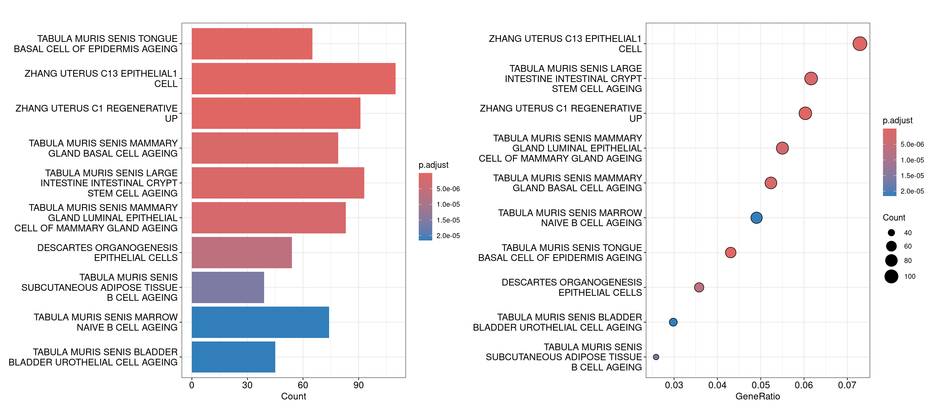
For the Enrichr webtool based analysis, we’ll open that TSV file in our Rstudio session, copy the genes, and paste them directly into the textbox on the right. The webtool should load multiple barplots with different enriched pathways. Feel free to click around and explore here. To compare the results against the results we generated in R, navigate to the Cell Types tab on the top and look for Tabula Muris.
An important component to a ‘good’ overrepresentation analysis is using one’s expertise about the biology in conjunction with the pathways identified to generate hypotheses. It is unlikely that every pathway in the plots above is meaningful, however knowledge of bladder cancer (for this dataset) tells us that basal and luminal bladder cancers share similar expression profiles to basal and luminal breast cancers reference. So, the overrepresentation analysis showing genesets like ‘Tabula Muris senis mammary gland basal cell ageing’ and ‘Tabula muris senis mammary gland luminal epithelial cell of mammary gland ageing’ could suggest that the difference in unsupervised clusters 9 and 12 could be coming from the basal and luminal cells. To investigate this further, we can compile a list of basal and luminal markers from the literature, generate a combined score for those genes using Seurat’s AddModuleScore function and determine if the clusters are split up as basal and luminal. For now we’ll use the same markers defined in this dataset’s original manuscript.
#define lists of marker genes
basal_markers <- c('Cd44', 'Krt14', 'Krt5', 'Krt16', 'Krt6a')
luminal_markers <- c('Cd24a', 'Erbb2', 'Erbb3', 'Foxa1', 'Gata3', 'Gpx2', 'Krt18', 'Krt19', 'Krt7', 'Krt8', 'Upk1a')

#read in the seurat object if it isn't loaded in your R session
merged <- readRDS('outdir_single_cell_rna/preprocessed_object.rds')

#use AddModuleScore to calculate a single score that summarizes the gene expression for each list of markers
merged <- AddModuleScore(merged, features=list(basal_markers), name='basal_markers_score')
merged <- AddModuleScore(merged, features=list(luminal_markers), name='luminal_markers_score')

#visualize these scores using FeaturePlot and VlnPlots
FeaturePlot(merged, features=c('basal_markers_score1', 'luminal_markers_score1'))
VlnPlot(merged, features=c('basal_markers_score1', 'luminal_markers_score1'), group.by = 'seurat_clusters_res0.8', pt.size=0)
Interesting! This analysis could lead us to conclude that cluster 12 is composed of basal epithelial cells, while cluster 9 is composed of luminal epithelial cells. Next, let’s see if we can use GSEA to determine if there are certain biological processes that are distinct between these clusters?
For GSEA, we need to start by creating a named vector where the values are the log fold change values and the names are the gene’s names. Recall that GSEA analysis relies on identifying any incremental gene expression changes (not just those that are statistically significant), so we will use our original unfiltered dataframe to get these values. This will be used as input to the gseGO function in the clusterProfiler library, which uses gene ontology for GSEA analysis. The other parameters for the function include OrgDb = org.Mm.eg.db, the organism database from where all the pathways’ genesets will be determined; ont = "ALL", specifies the subontologies, with possible options being BP (Biological Process), MF (Molecular Function), CC (Cellular Compartment), or ALL; keyType = "SYMBOL" tells gseGO that the genes in our named vector are gene symbols as opposed to Entrez IDs, or Ensembl IDs; and pAdjustMethod="BH" and pvalueCutoff=0.05 specify the p-value adjustment statistical method to use and the corresponding cutoff.
#read in the epithelial de df we generated previously
de_gsea_df <- read.csv('outdir_single_cell_rna/epithelial_de_gsea.tsv', sep = '\t', row.names = 1)
#if you can't find the file in your session, we have uploaded a version for you
#de_gsea_df <- read.csv('/cloud/project/data/single_cell_rna/backup_files/epithelial_de_gsea.tsv', sep = '\t')

#get all the foldchange values from the original dataframe
gene_list <- de_gsea_df$avg_log2FC
#set names for this vector to gene names
names(gene_list) <- rownames(de_gsea_df)
#sort list in descending order of log2FC values as that is required by the gseGO function
gene_list = sort(gene_list, decreasing = TRUE)

#now we can run the gseGO function
gse <- gseGO(geneList=gene_list,
             OrgDb = org.Mm.eg.db,
             ont ="ALL",
             keyType = "SYMBOL",
             pAdjustMethod = "BH",
             pvalueCutoff = 0.05,
             nPermSimple=100000)
#explore the gse object by opening it in RStudio.
#It basically has a record of all the parameters and inputs used for the function,
#along with a results dataframe.
#we can pull this result dataframe out to view it in more detail
gse_result <- gse@result
Looking at the dataframe, you might notice that there are around 900 rows, and similar to the overrepresentation analysis, it is unlikely that all of them are truly meaningful. You can skim through all these results to determine which ones might be biologically meaningful, but in the interest of time, here we will subset the gse object to any pathways that have the word epithelial in them, and use those for plotting. In order to subset the object, we will determine the indices of the rows which have these values using R’s which and grepl functions, and then subset the results dataframe in the gse object to those rows. All of these genesets end up having negative enrichment scores (or are downregulated in our putative luminal cell cluster), so we will add one index that has a positive enrichment score to aid in plotting. For plotting, we will use the dotplot, cnetplot, and heatplot functions.
Note- we do not suggest this strategy of grabbing pathways of interest in this manner- we are only using it as an illustrative example here.
#start by grabbing the indices we'll need to subset the `gse` object
#epithelial indices from gse object using which and grepl
epithelial_indices <- which(grepl("epithelial", gse@result$Description))
#index for the most positive enrichment score using which.max()
positive_index <- which.max(gse@result$enrichmentScore)
#concatenate these indices to get the list of indices that will be used to subset the gsea object
subset_indices <- c(positive_index,epithelial_indices)

#now create a new gse_epithelial object and subset the gse object to these indices
gse_epithelial <- gse
gse_epithelial@result <- gse_epithelial@result[subset_indices,]

#plot!
#dotplot - splitting by 'sign' and facet_grid together allow us to separate activated and suppressed pathways
dotplot(gse_epithelial, showCategory=20, split=".sign") + facet_grid(.~.sign)

#heatplot - allows us to see the genes that are being considered
#for each of the pathways/genesets and their corresponding fold change
heatplot(gse_epithelial, foldChange=gene_list)

#cnetplot - allows us to see the genes along with the various
#pathways/genesets and how they related to each other
cnetplot(gse_epithelial, foldChange=gene_list)
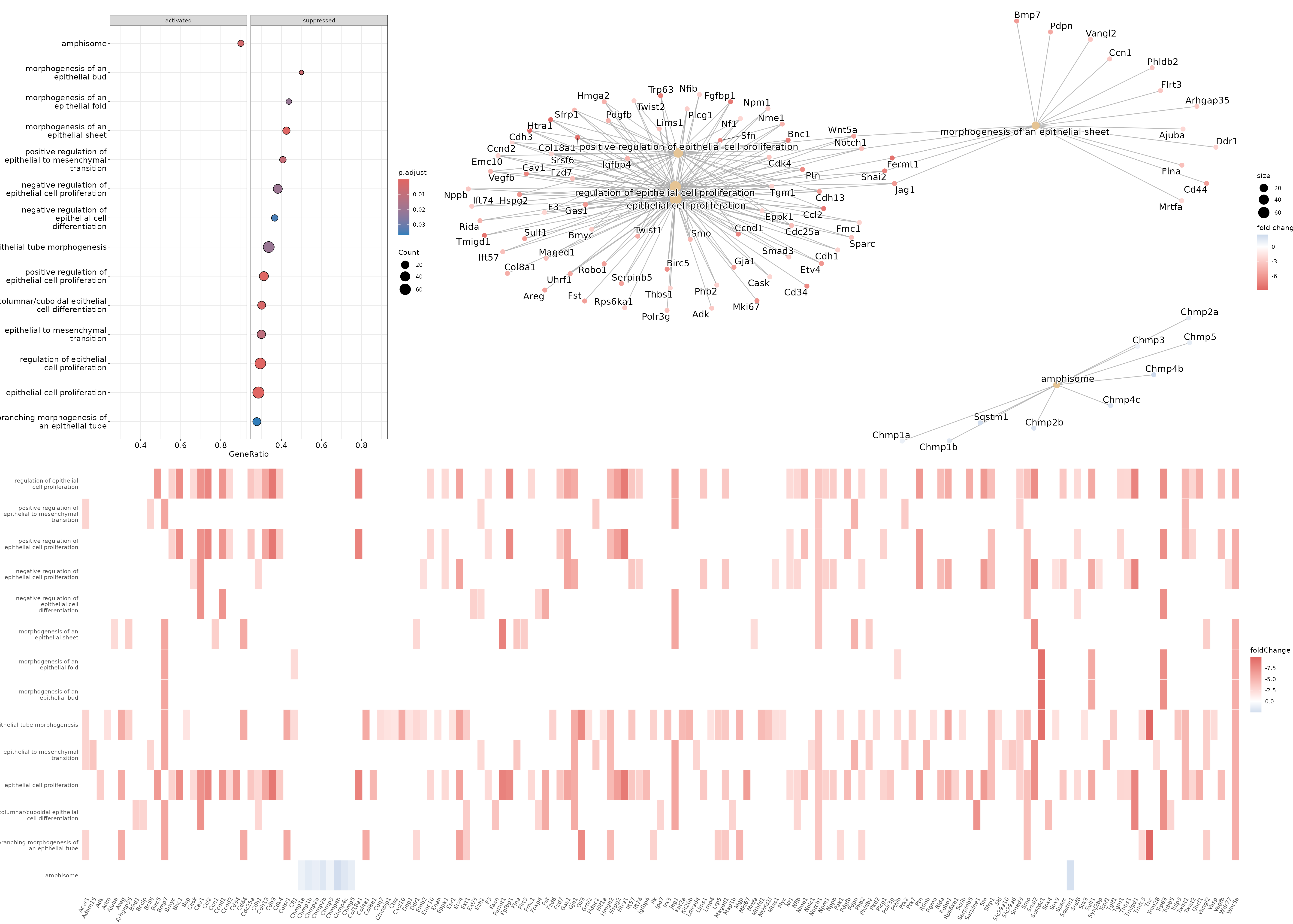
Based on these results, we could conclude that cluster 9 (putative luminal cells) have lower expression of quite a few pathways related to epithelial cell proliferation compared to cluster 12 (putative basal cells).
As an additional exercise, let’s try to do an overrepresentation and/or GSEA analysis for the DE analysis we did on CD8 T cells using the cd8tcells_de_gsea.tsv DE outputs we generated previously. If you do not have the file, it can be downloaded as follows-
download.file(url = 'https://genomedata.org/cri-workshop/reference_files/cd8tcells_de_gsea.tsv',
              destfile = 'outdir_single_cell_rna/cd8tcells_de_gsea.tsv')
Hints:
M8:... cell type signature gene sets may not be the most relevant. You may wish to download a different set of gene sets (e.g., MH: hallmark gene sets). Visit msigdb mouse collections, download the ‘Gene Symbols’ GMT file for the gene sets of interest, upload to your posit cloud environment, and modify the relevant R commands to load in the gmt file.grepl for immun instead of epithelial.If you get through all that, hopefully you will see that the CD8 T cells from the ICBdT condition have various immune response related pathways downregulated when compared to the ICB condition!